brand dna | 2019-2020

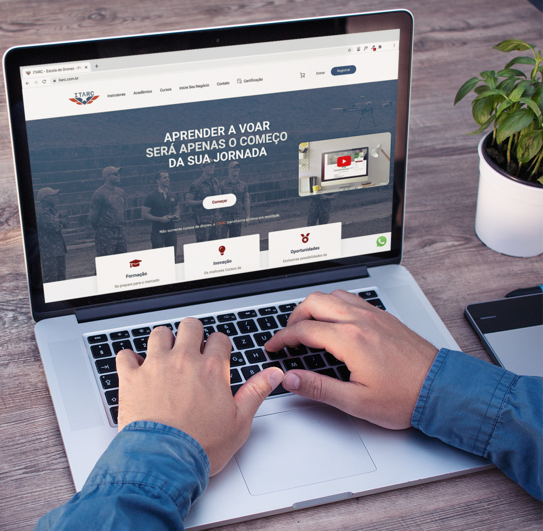


ITARC is an Institute focused on training for the national and international drone market. It inspires people by giving more than the basis for learning. Its courses make the ordinary turn into extraordinary through its own teaching methodology and innovative processes. The Institute proves to each student that it is possible to become a professional and make profit in this growing market.
Remotely controlled vehicles are one of the main growing technologies in the world. Based on this trend, the company was already active in the market on several fronts, but it needed to expand its niche beyond the military. It needed to broaden customers diversity and to target younger age groups.
In addition to creating resources for a dialogue between the school and its public, bringing credibility and professionalism, was necessary to create a new identity to solving issues caused by the perception of the old brand. Flaws in the positioning of ITARC and its brand communication were noticed. Its very rigid forms led the public to associate the company with other branches such as: car agencies, football teams, fashion and men’s shoes. An institute with a unique methodology lacked an equally unique and magical brand experience, combined with the possibility of life transformation offered to the student.
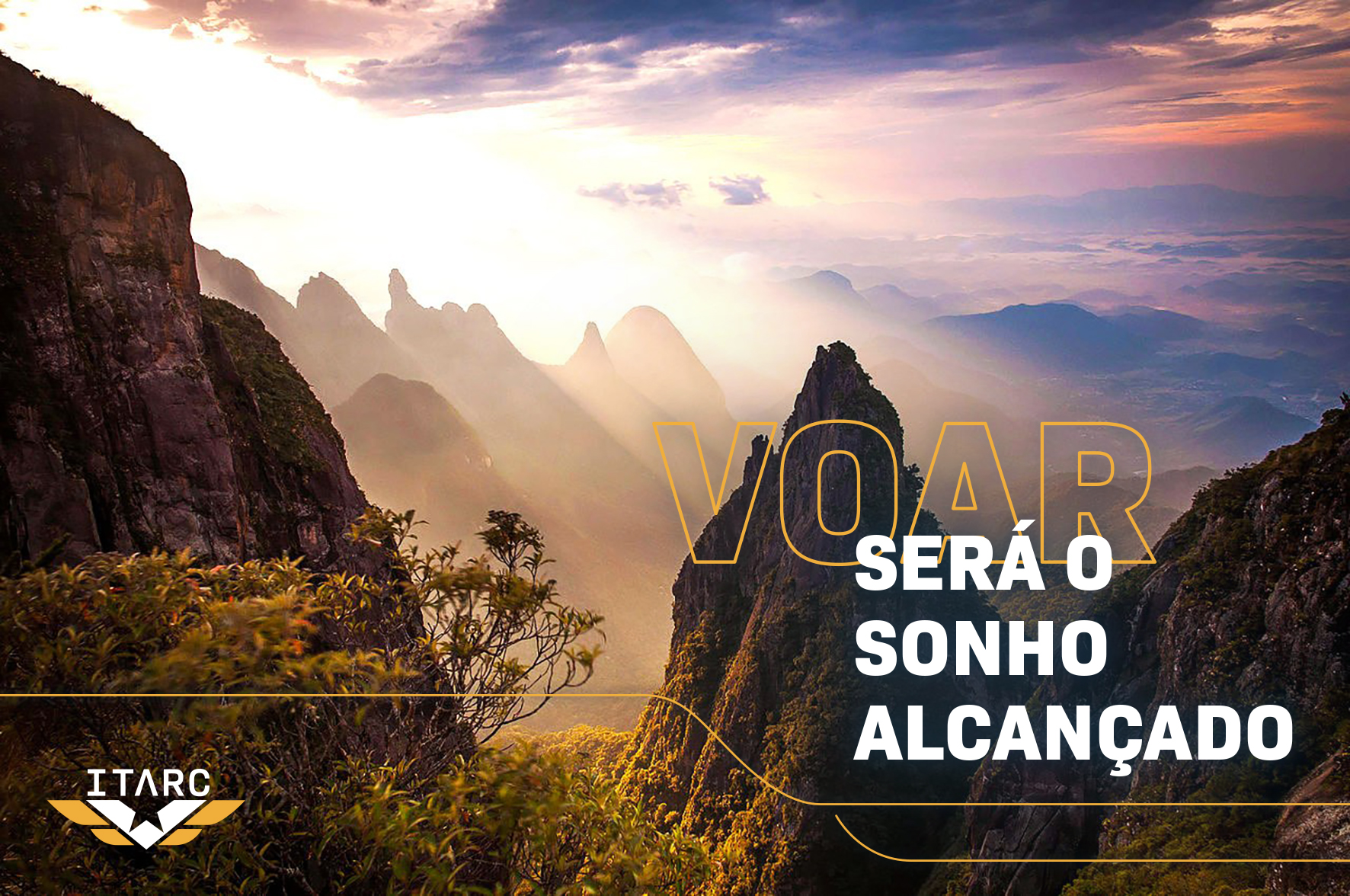
Flying will be your deam come true
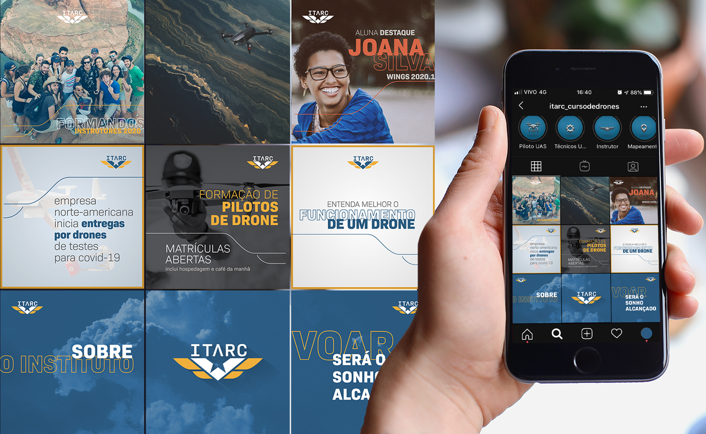
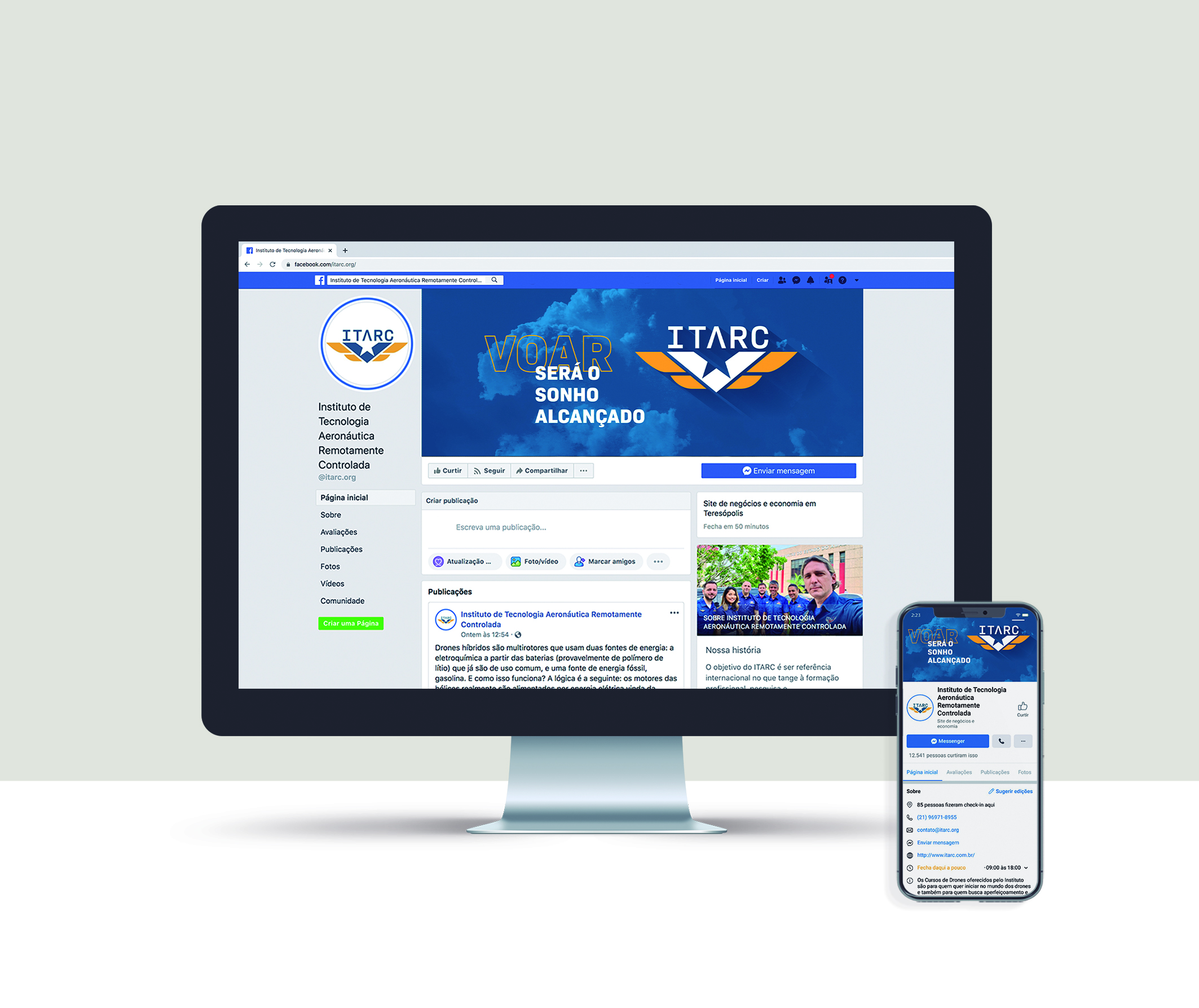
ITARC offers the average student the power to become a pilot and entrepreneur. Turns the dream of flying into reality. Starting from the pains points identified by Criamia, the personality of the company, the purpose of the brand and the target public were defined, in collaboration with the ITARC team. The new brand strategy was developed, producing a brand positioning, promise, tone of voice, visual identity and initiatives aiming to show the Institute differentials and expanding its audience beyond the military environment.
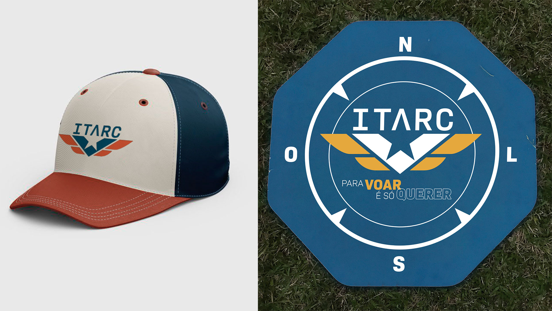
Through a technological and youthful aesthetic, well crafted forms, and an exciting new strategy, the misperception of a rigid and military institute was broken. The company today shows that it’s possible to associate the “military” with the magic of flying and transforming futures.
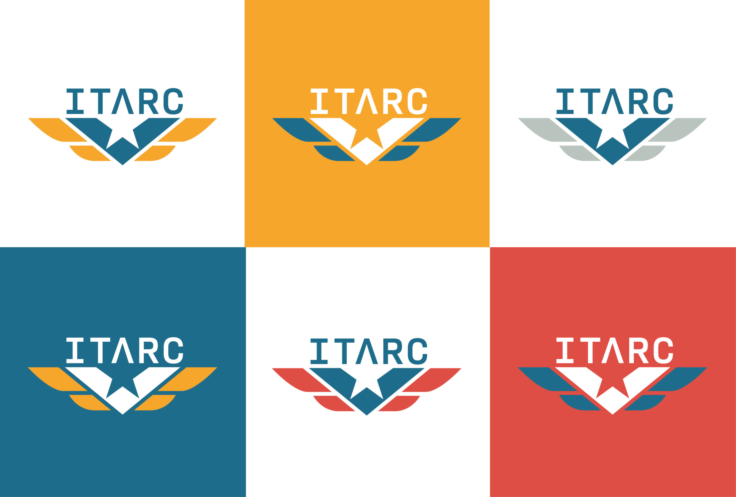
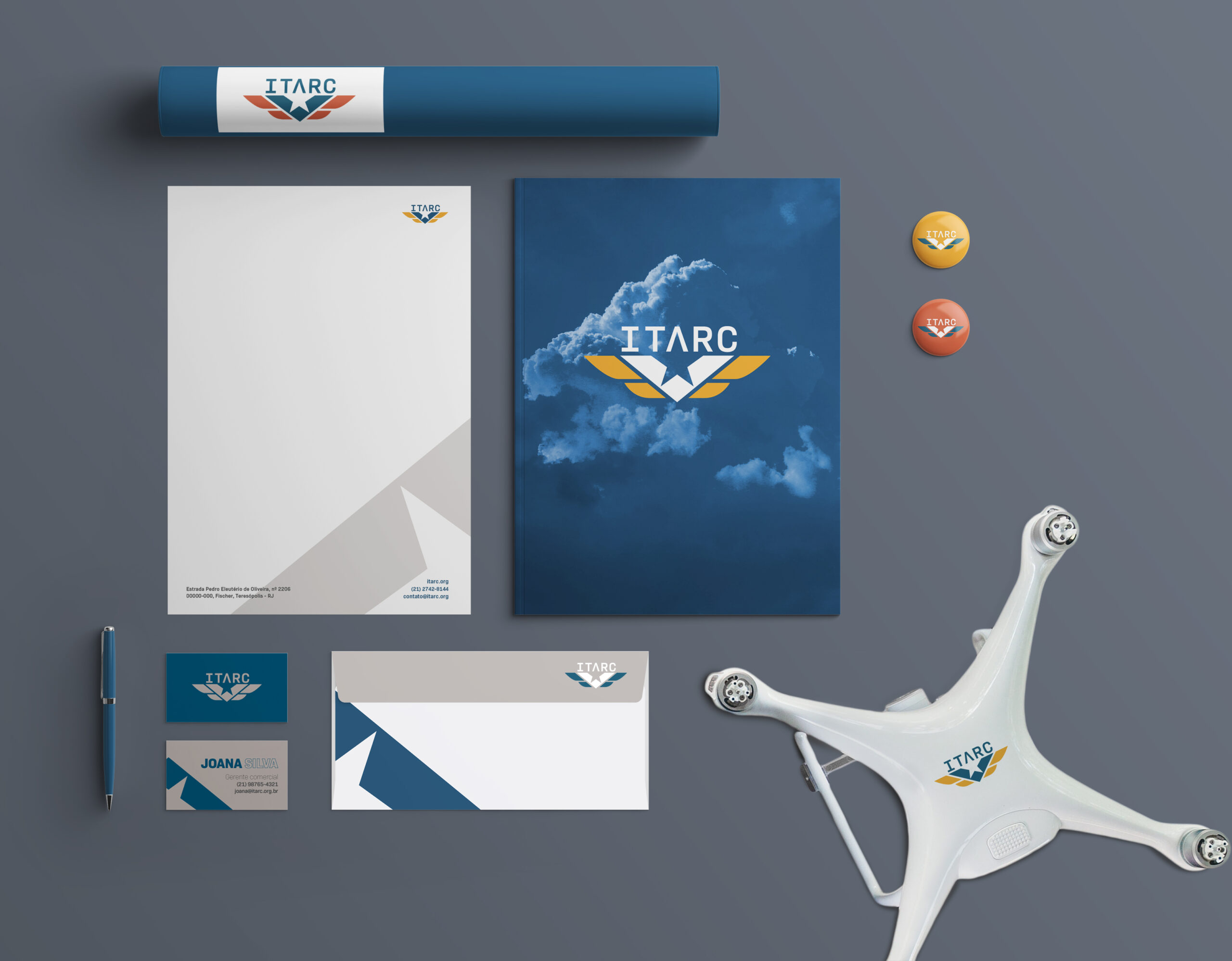
Its colors were based on the noble metals such as gold, palladium and copper, used in technological resources and referring to the cutting-edge technology. Blue makes the brand return symbolically to aviation and the sky. Repositioning the Institute’s language to solve misperceptions was essential. Due to this, ITARC now shows its customers that flying not only allows to see the world from unique perspectives, but also the possibility of transforming their lives with autonomy and freedom.