brand manual | 2020
The public that exercises and seeks to have a healthy life avoid having a diet that is not natural. How not to think the same for our best friend? Amordida is a brand that aims to offer the ideal solution for any dog: a fresh, natural and balanced diet by qualified professionals. Amordida pet food gives you the guarantee of knowing what your pet is consuming, in addition to being much tastier.
To develop the visual identity of the Amordida brand, we immerse into the universe of puppies and natural food. An important aspect of the project, which guided us throughout the development, was the need to create a sensory experience, both in terms of food and affect, bringing joy, play and love to the brand’s identity.
Freshness, energy and well-being!
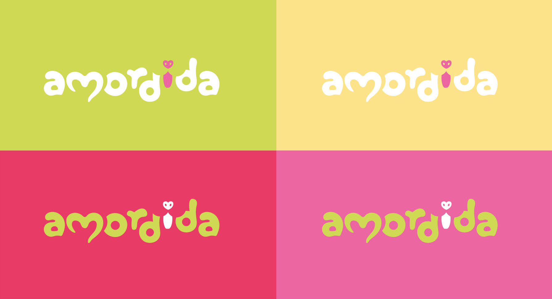
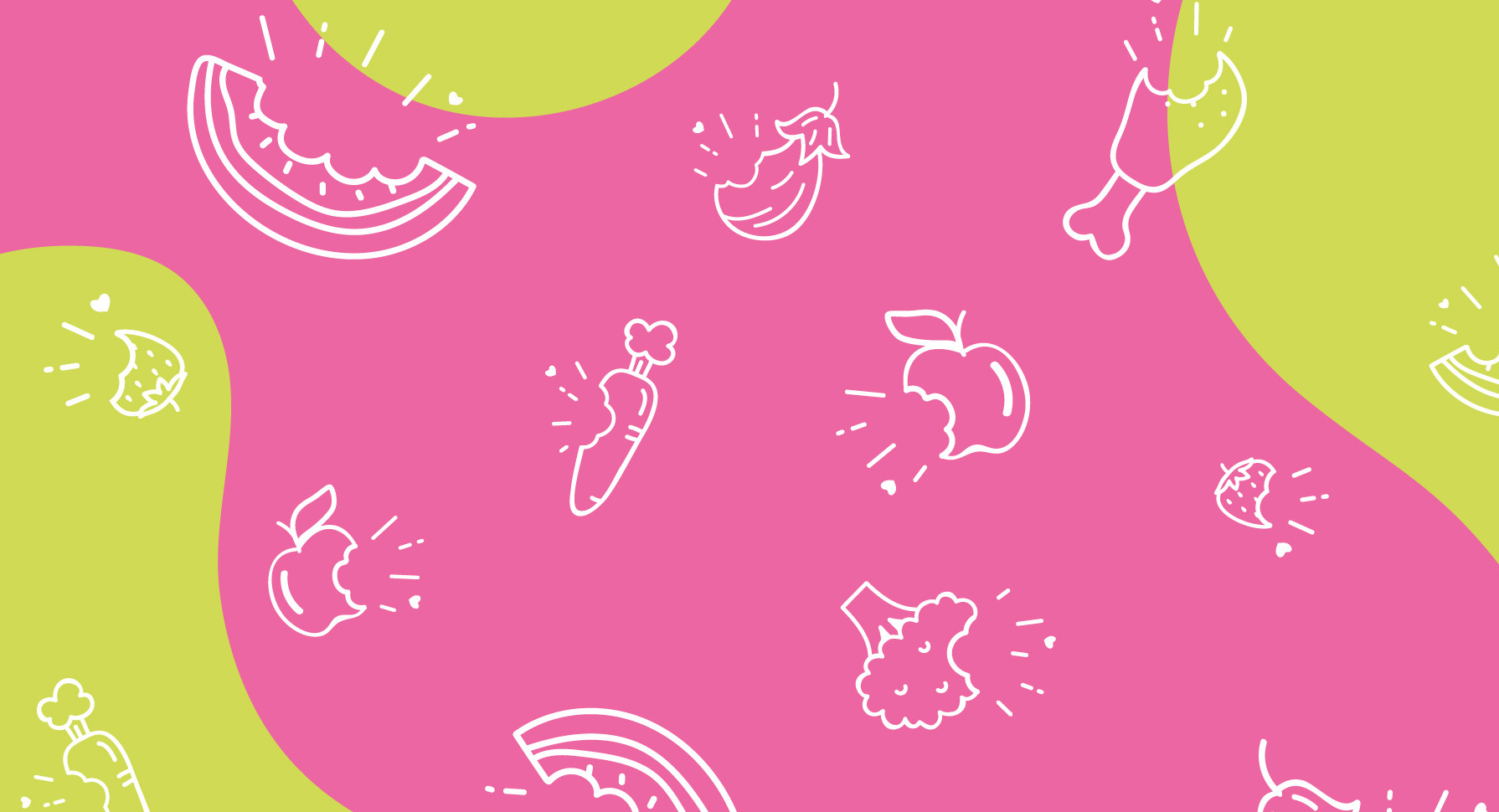
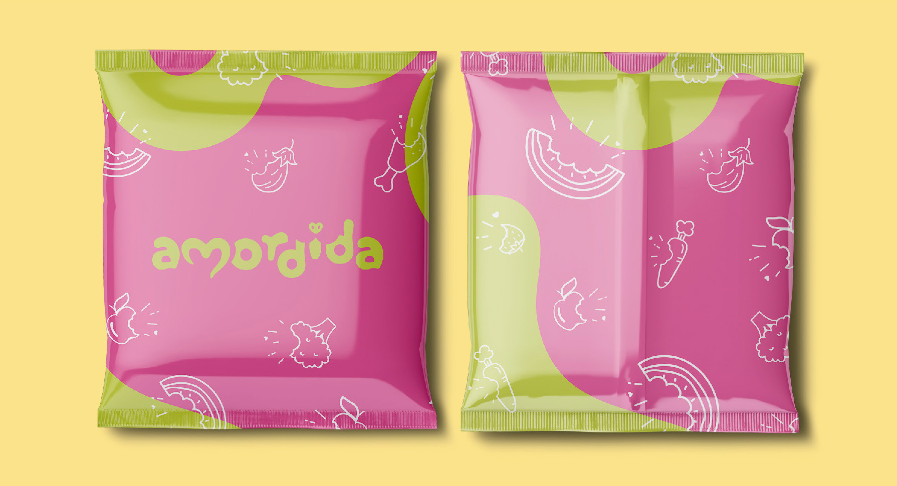
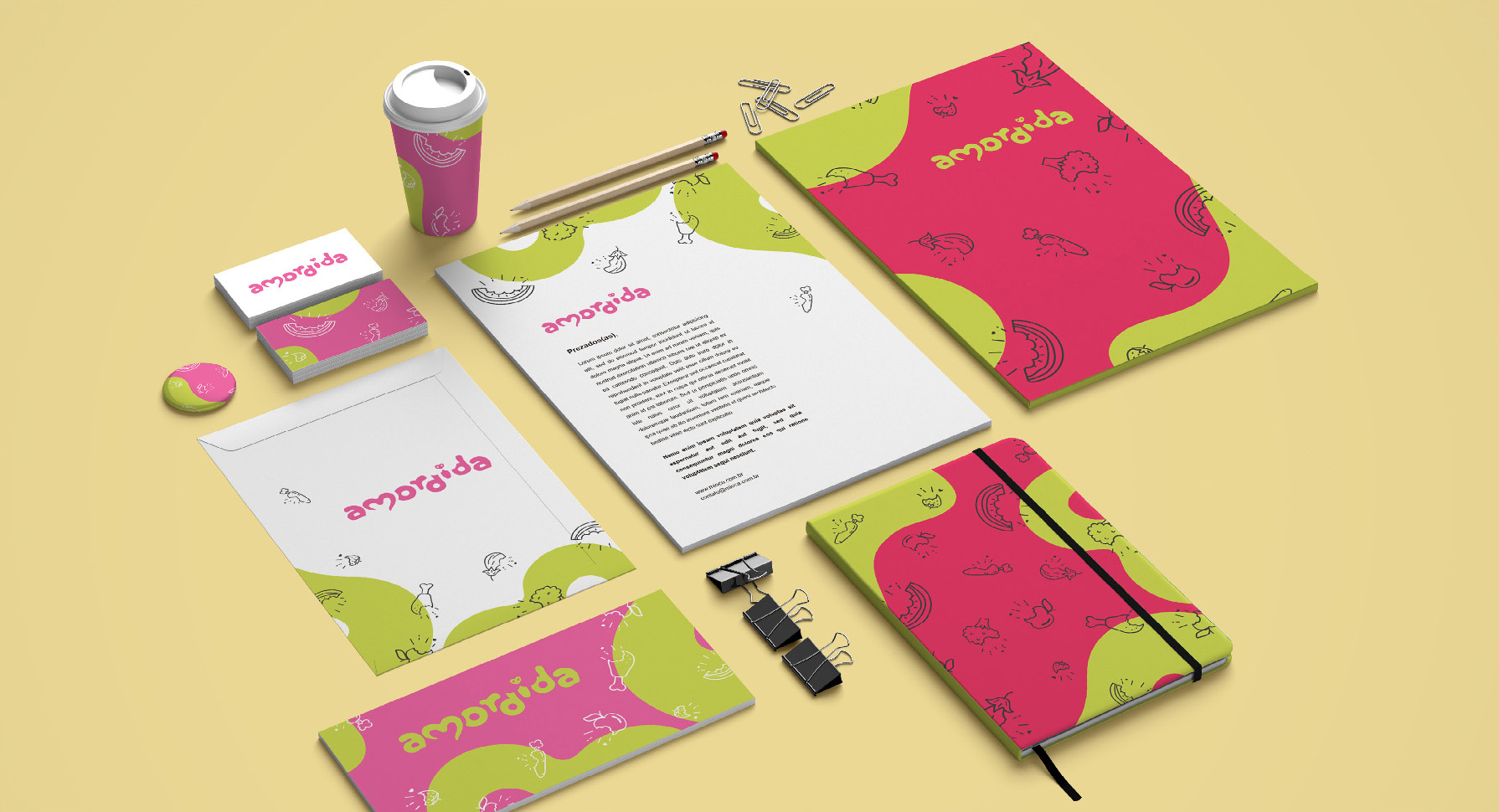
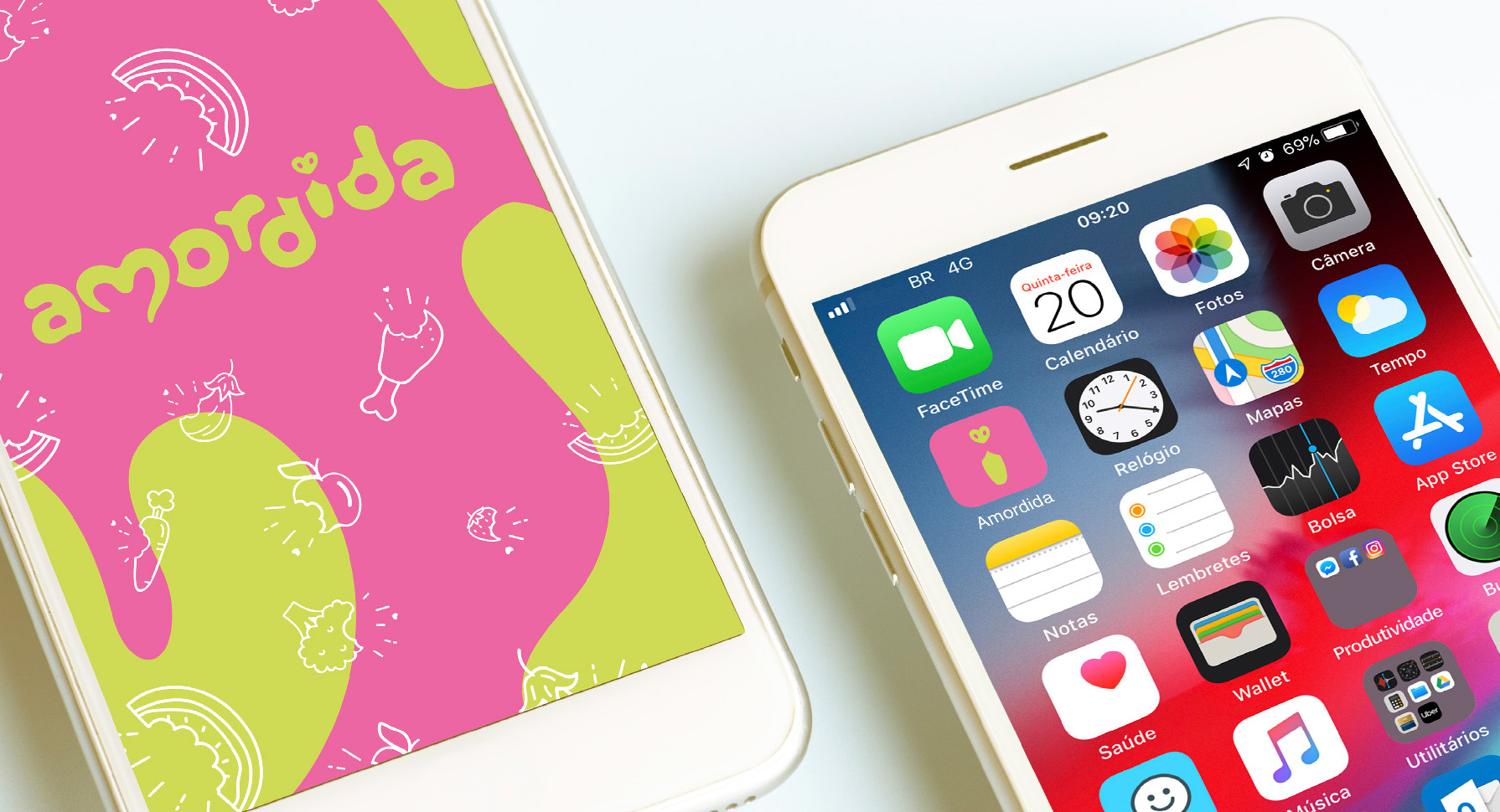
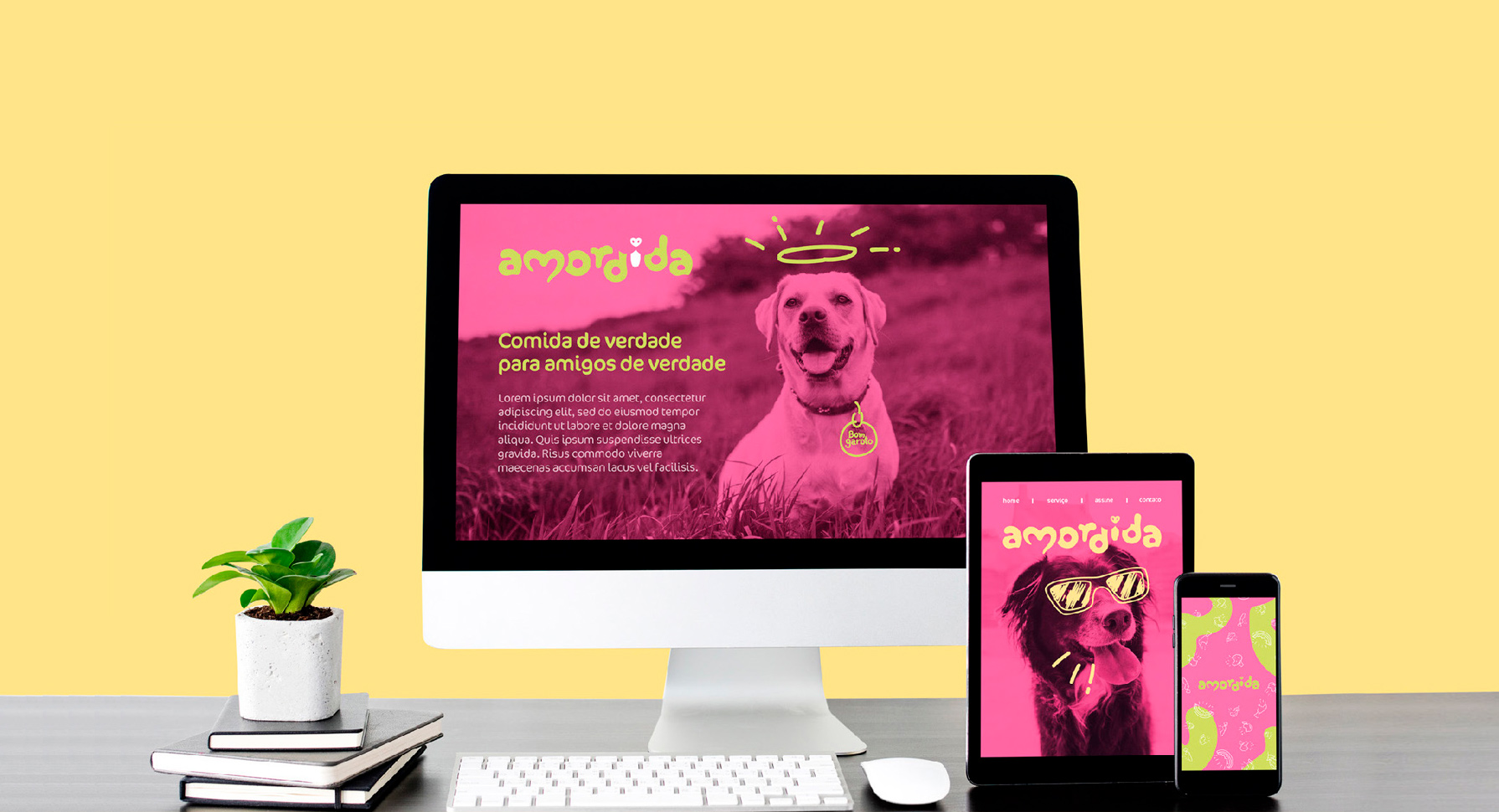
We selected a vibrant palette! We brought color references that refer to well-being and especially good nutrition. Colors that evoke the freshness and flavor of fruits and, at the same time, convey a feeling of joy and welcome. In addition, the contrast between the shades of Pink, Citrus Green and Yellow give strength and personality to the brand’s identity.
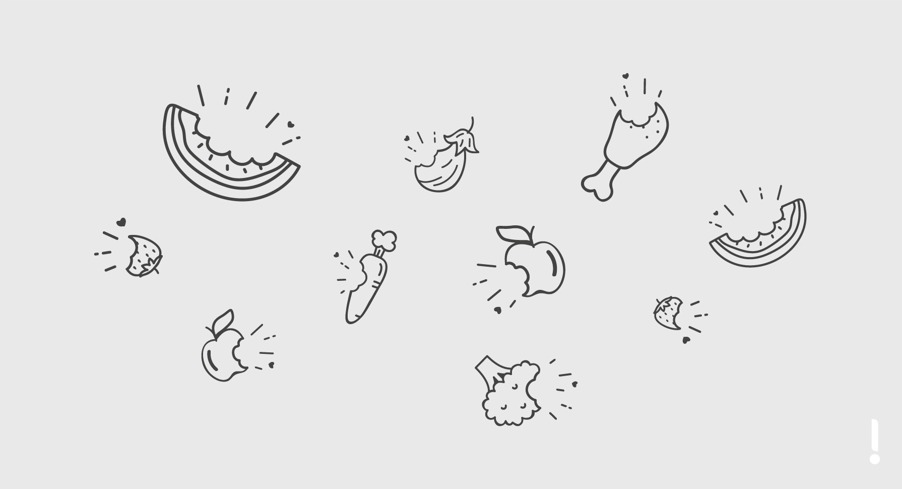
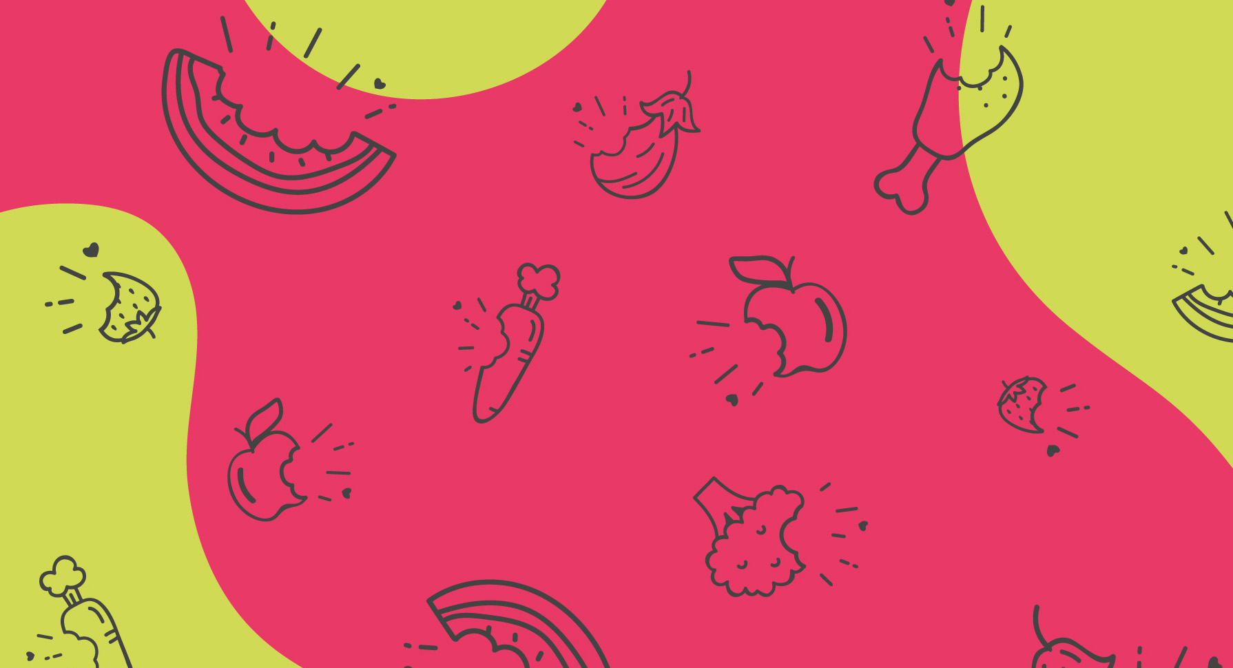
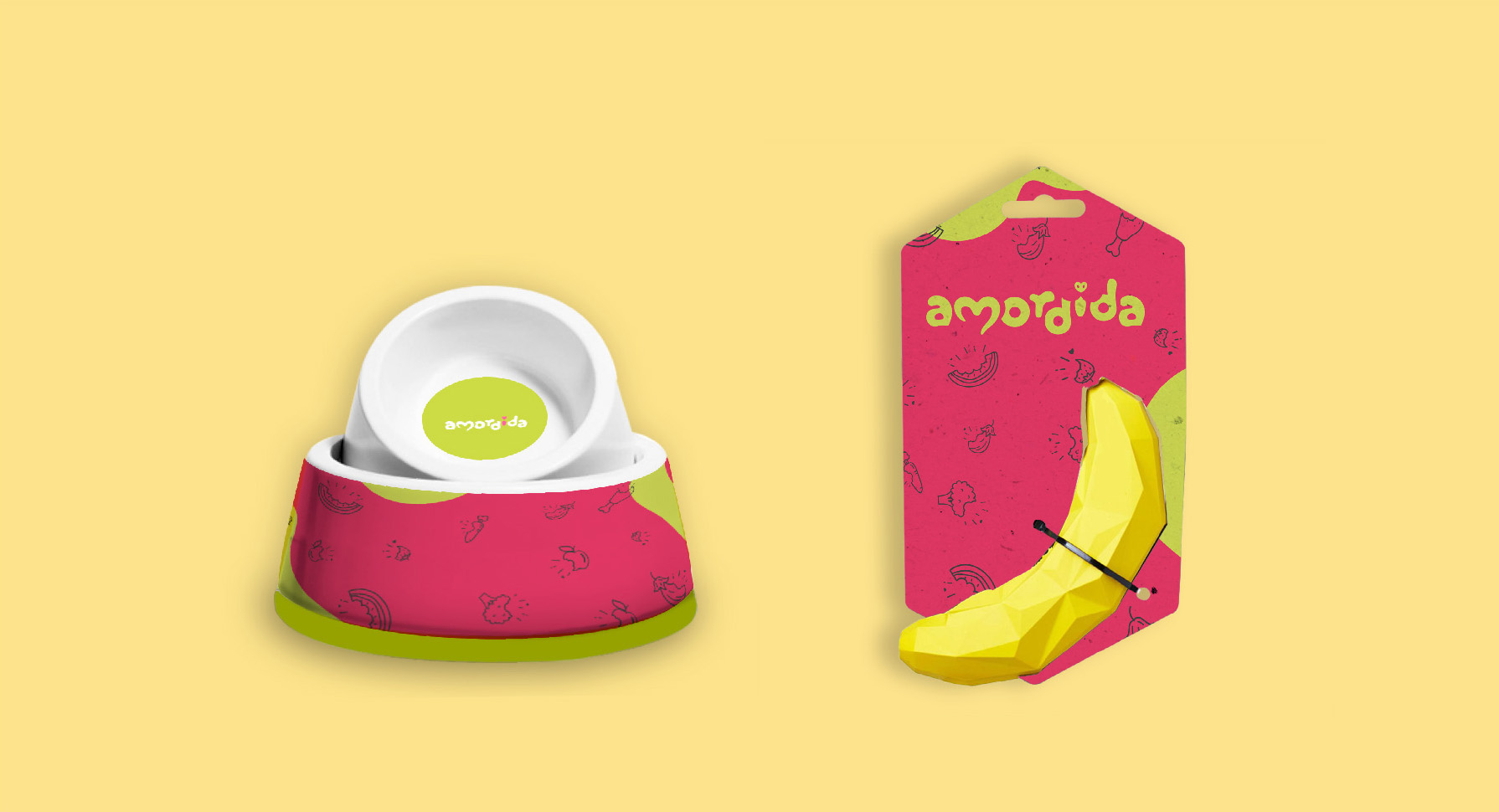
We also created a series of illustrations to compose the visual identity of the Amordida brand. We objectively portray the service offered by the company, conveying the joyful and pleasant feeling of nibbling a natural and very tasty food. Carrots, cauliflower, watermelon, apple, strawberry and chicken are some of the elements that are part of the identity’s visual menu.
Amordida: love in the shape of food!
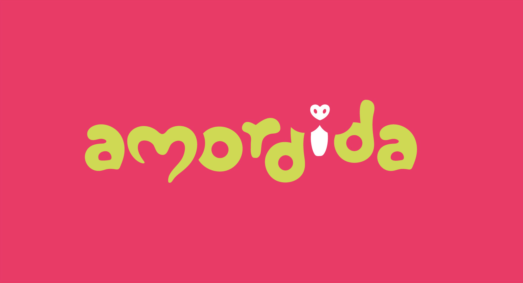
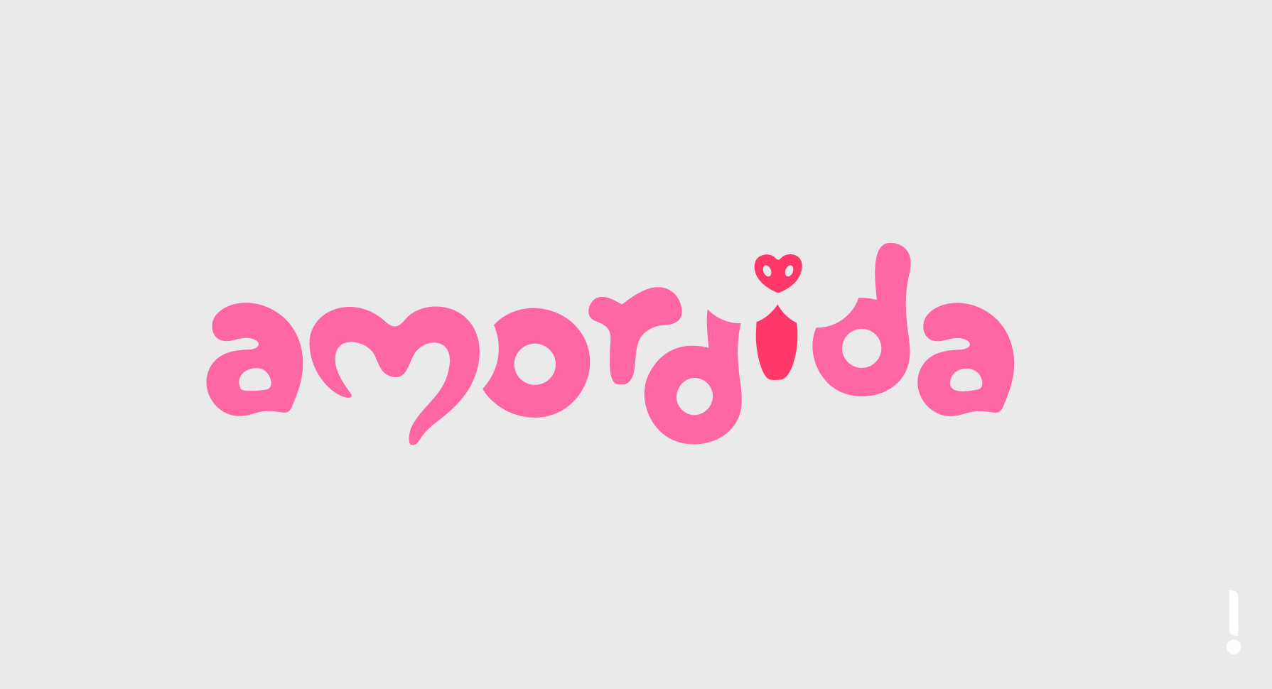
Love in the shape of food and a brand in the shape of love! The Amordida concept invites us to taste the brand itself. We created an exclusive letter design, whose organic shapes refer to food and awaken the palate. The “m” in Amordida reminds us of the shape of a heart, while the letter “i”, through an optical game of figure and background, gives us the idea of the puppy itself biting and savoring the brand. Amordida provides us with a complete sensory experience!