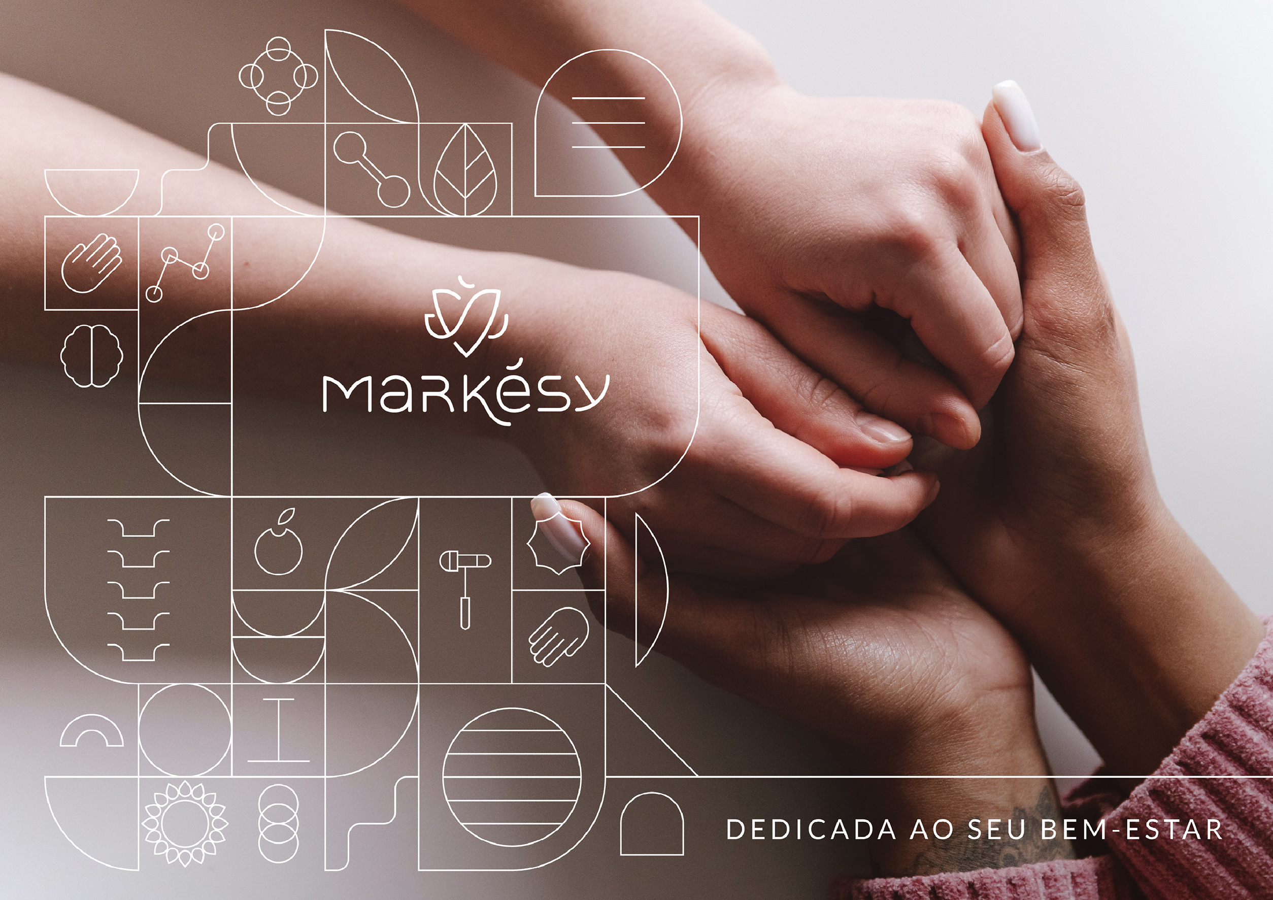


Aline and Rômulo have always believed in the importance of a humanized approach to all services in the field of health. When they founded Markésy, they envisioned an integrated center focused on providing relief from pain (physical, emotional, or psychological) and the total well-being of their clients and collaborators. It was necessary to create a Visual Identity that consistently and authentically conveyed the brand’s essential values, such as knowledge, care, and affection. Additionally, the Identity needed to express the integrative character of the company, capable of balancing all the solutions offered without prioritizing a specific service.
The “Markésy” project involves the development of a dynamic and captivating Visual Identity for the brand. Markésy seeks to integrate various high-quality medical services while emphasizing its humanistic and affectionate stance. The central concept is to convey the bond of affection between the team and patients, creating a welcoming environment where well-being is achieved through the balance of body, mind, and spirit. The project includes the creation of a symbol, logo, and graphic elements that reflect this proposal for comprehensive care and emotional connection.
The path to total well-being.
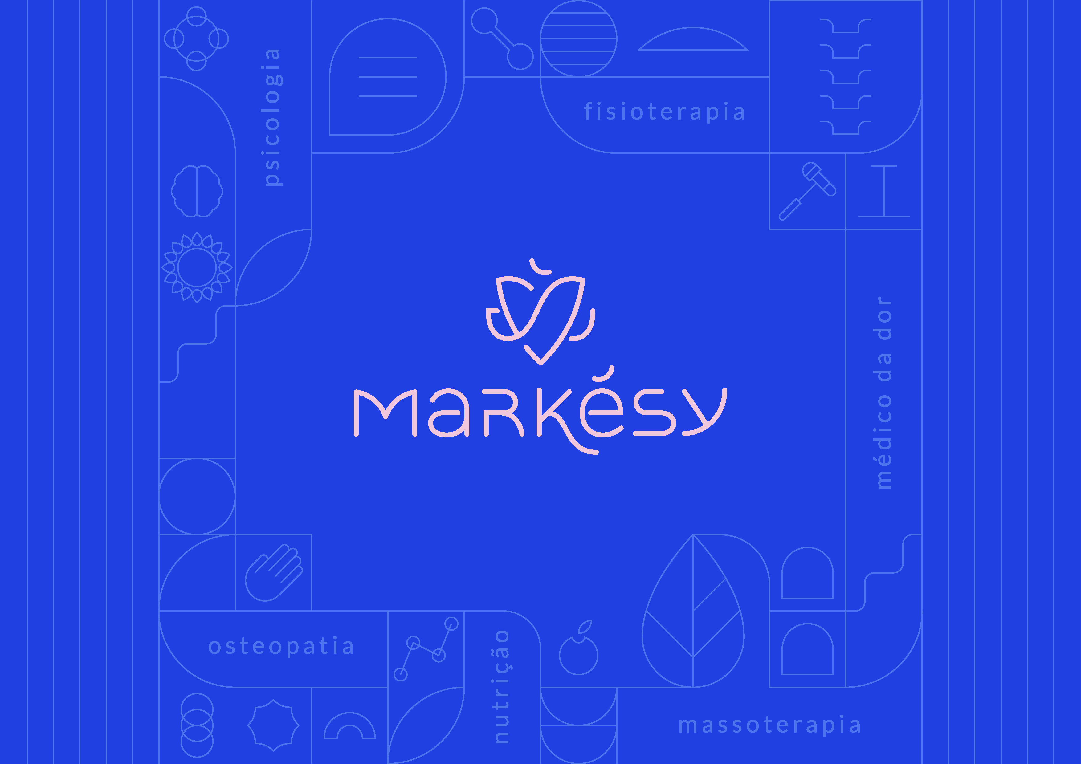
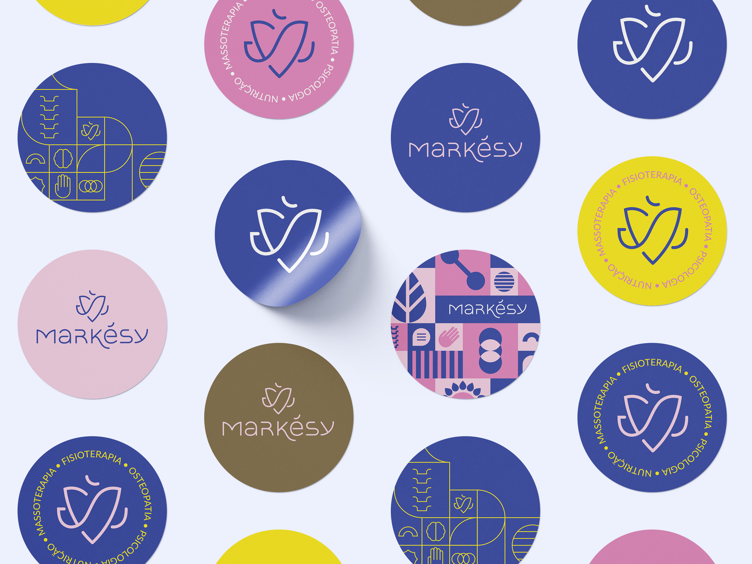
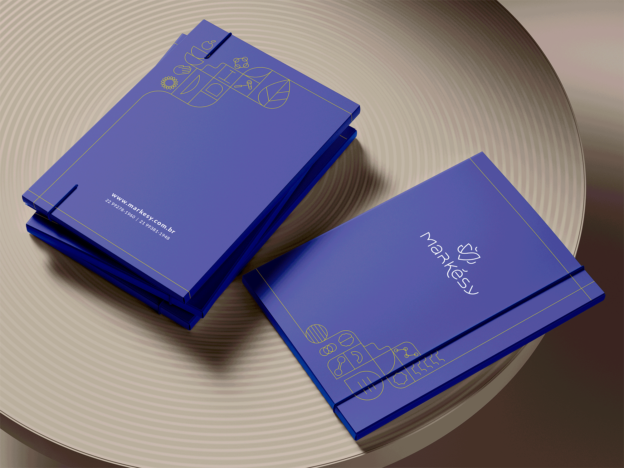
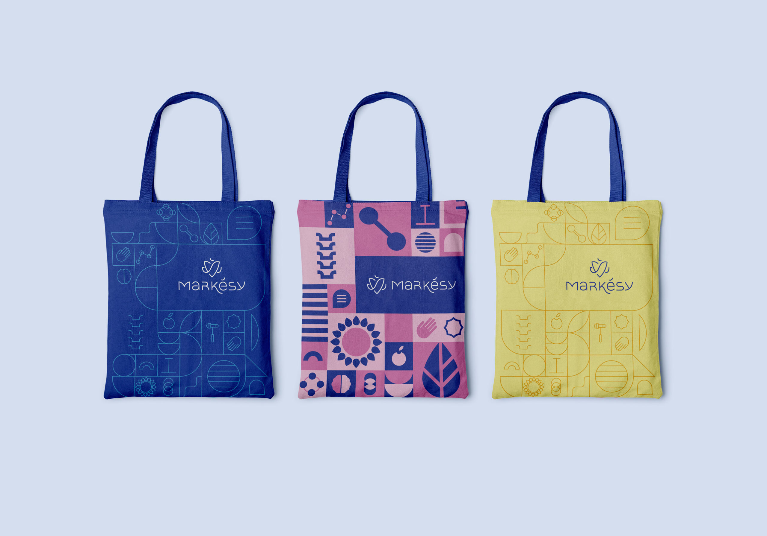
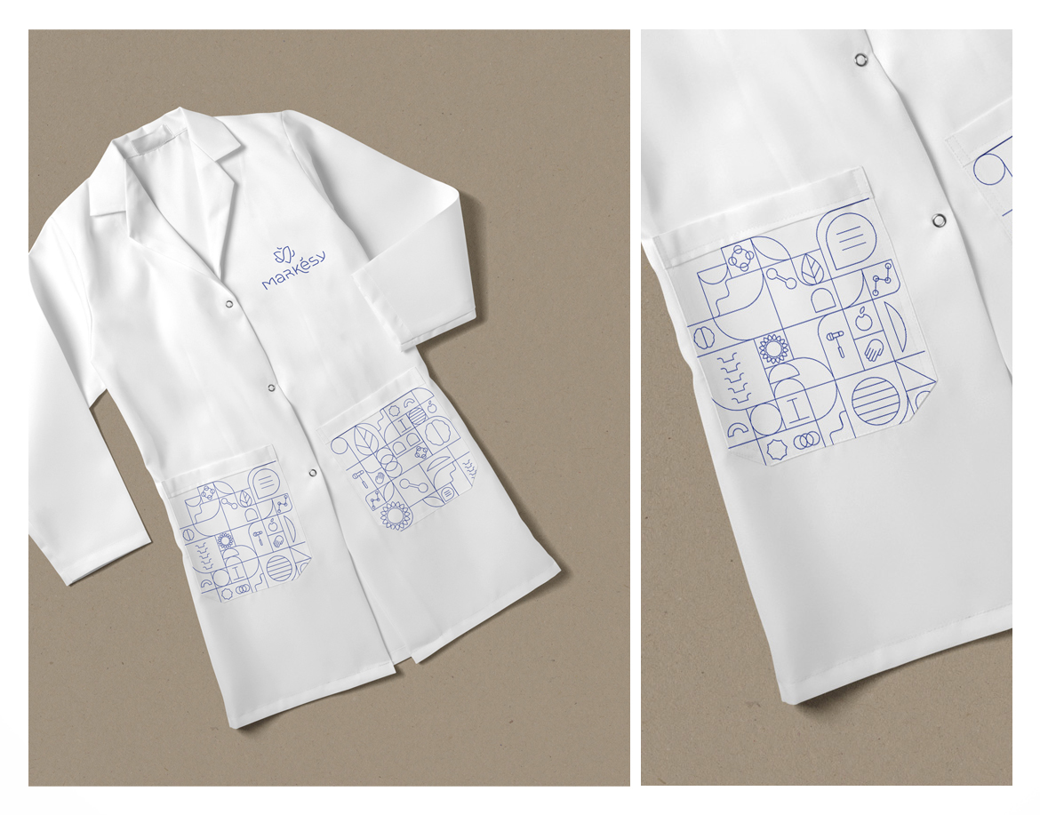
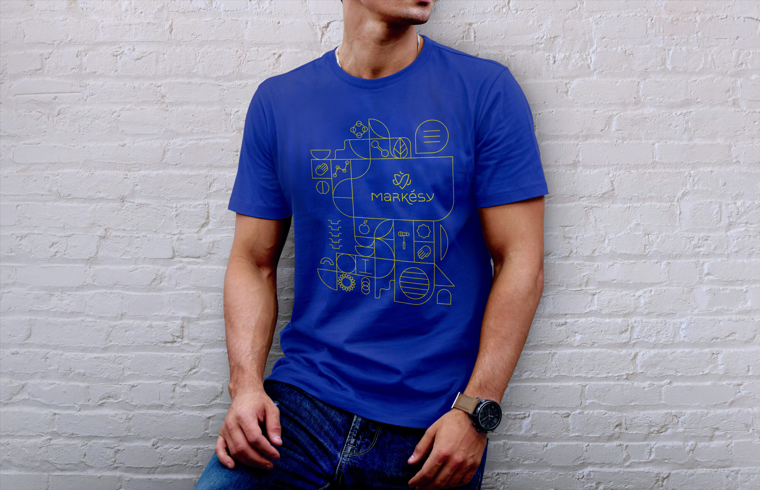
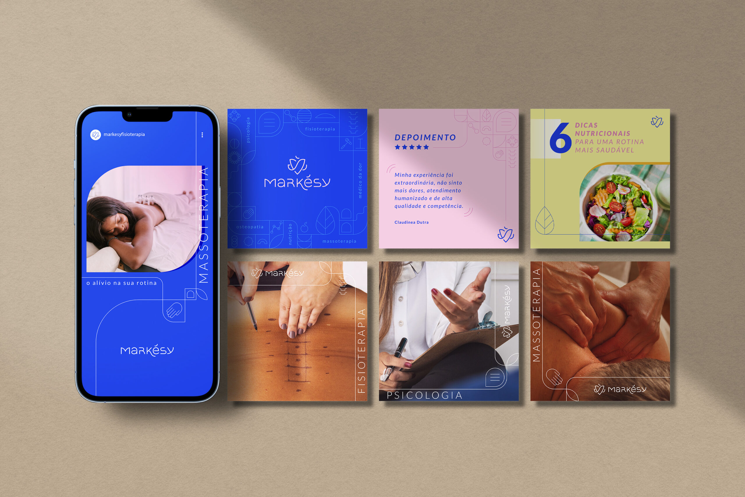
We developed a Visual Identity capable of objectively communicating the humanistic essence of the brand and balancing its vast and complex range of services. Through a diverse color palette, creating a balance between soft and stimulating colors that highlight various tones of human skin, we aim to communicate the humanistic and inclusive essence of the company, encouraging communication that reflects warmth. The graphic elements, especially the heart symbol, associate the brand with a vital solution that values balance, affection, and expansion, permeating the entirety of being for complete well-being.
Affection and connection between patients and collaborators.
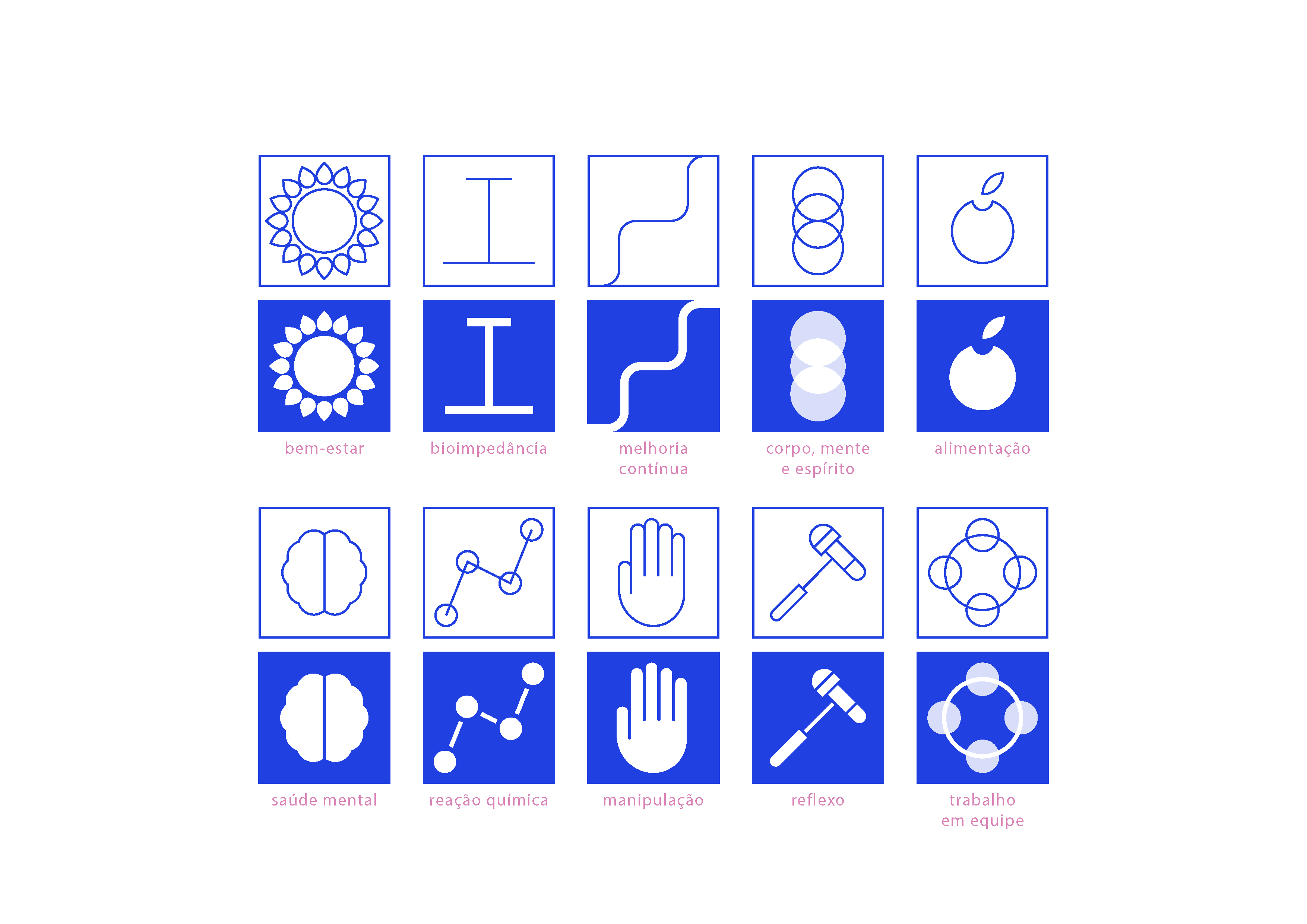
The iconography created for the Markésy brand symbolically represents its welcoming and modern essence. Chosen as the main symbol of the brand, the human heart is the key element of the Identity. It marks the life cycle of each human being. Composed of lines that convey balance and fluidity, it symbolizes affection and connection between patients and collaborators. This humanistic approach is reflected throughout the Visual Identity, from the color palette to the typographic composition, expressing movement and integration.
The brand consistently conveys the commitment and professionalism of the company while embracing the idea of health-related services with a closer and more human approach. Markésy is a brand capable of uniting knowledge and affection in its daily operations. It is ready to solidify its image in the market, being recognized for its integrative and welcoming approach, providing a unique and emotionally meaningful experience in its services
Need help implementing or developing your Visual Identity project? Contact Criamia here.
