

Naming and graphics for an English teacher…for Morena. She was born to teach. Communicative and extroverted. Clear and committed. All she needed was an identity that could show all this.
The challenge was to create a trade dress that reflected the personality and spontaneity of the person and the professional. In this project, the person is Morena herself.
Moreena tropicana.
To position itself as a brand, Morena needed a name. And why not using her own name?
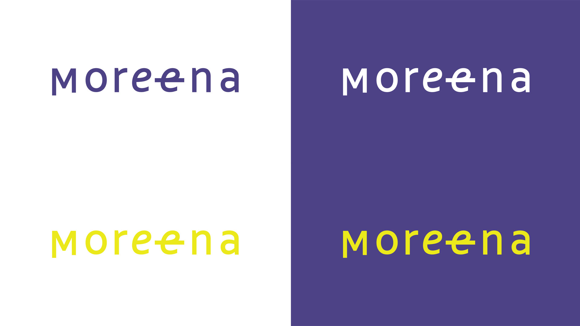
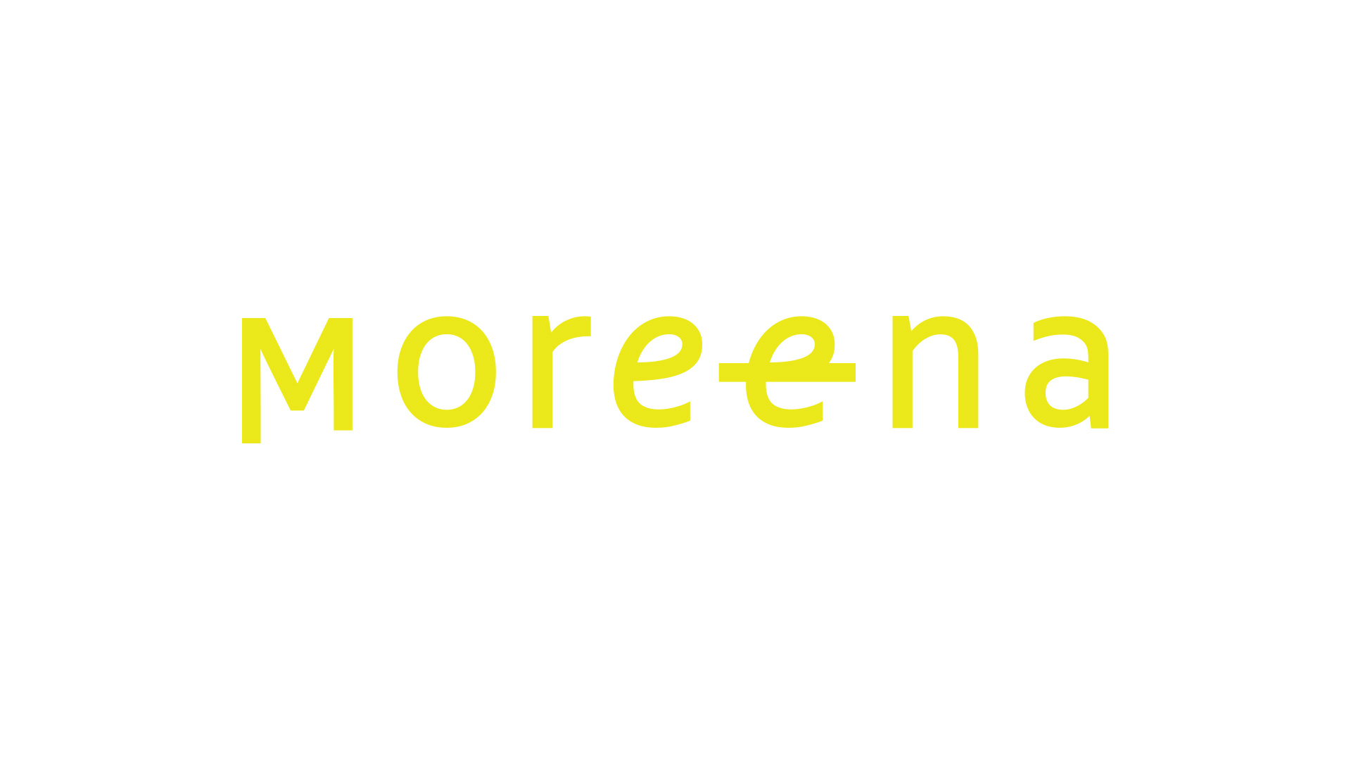
First we developed the naming: Moreena, with double ‘e” making the /ē/ sound of the long vowel, as spoken in English. A joke, a differential and a referential to the language.
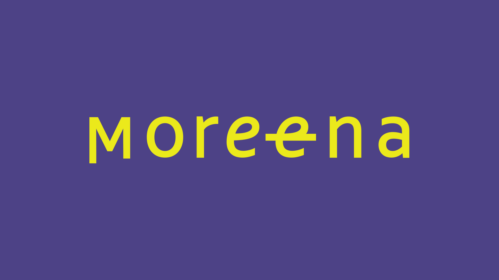
The second part of the work was to create a graphical signature for that name. We developed a clean brand, focused on the name. The double and scratched through ‘e’ is a play with the letter: does this word have a double ‘e’? Is it Morena or Moreena? Following the teacher’s style of teaching the English language, the most important thing is not to speak as a native “American” but to understand the language. The most important thing when learning a language is to understand and be understood.
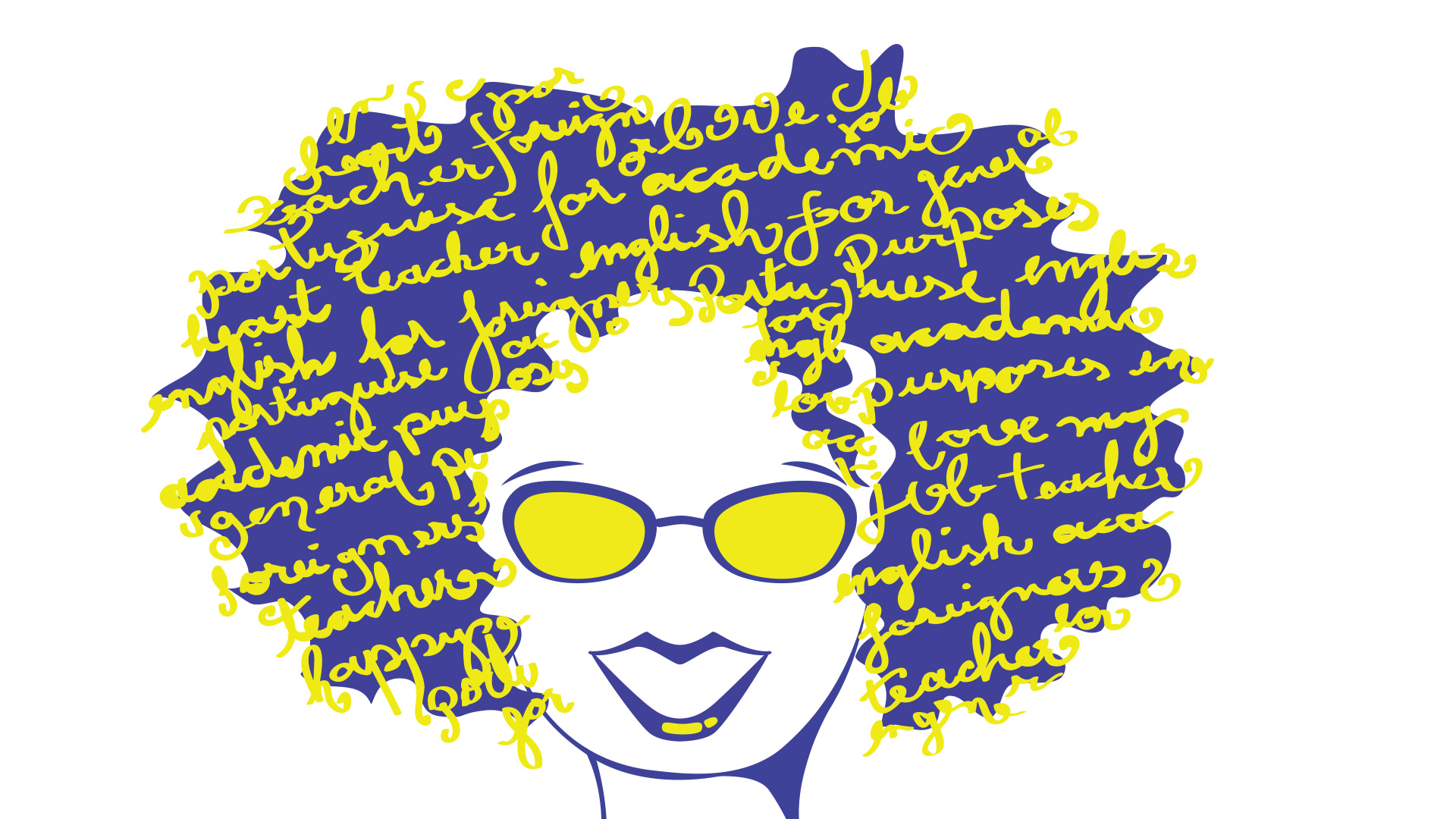
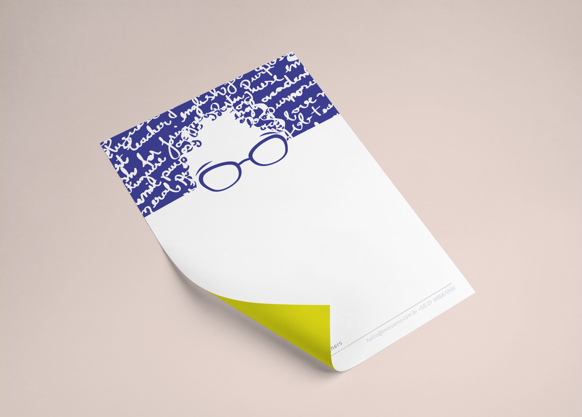
Finally, we redraw and refreshed the picture that characterizes the teacher. The character is the teacher herself. This picture was a success when we launched it 2 years before the brand. Bringing her back in this redesigned project with new colors will further strengthen Moreena’s personality.
Under the curls of her hair: naming and graphics for an English teacher.
Yellow, energy and life, sun, heat, carioca (meaning born and raised in Rio de Janeiro).
Blue, a color that is common to the American, British and Brazilian flags. A color quite used in mimeographs, where teachers traditionally prepared the exams with all the affection.
An energetic combination, in high spirits. A teacher with personality. A living brand.
