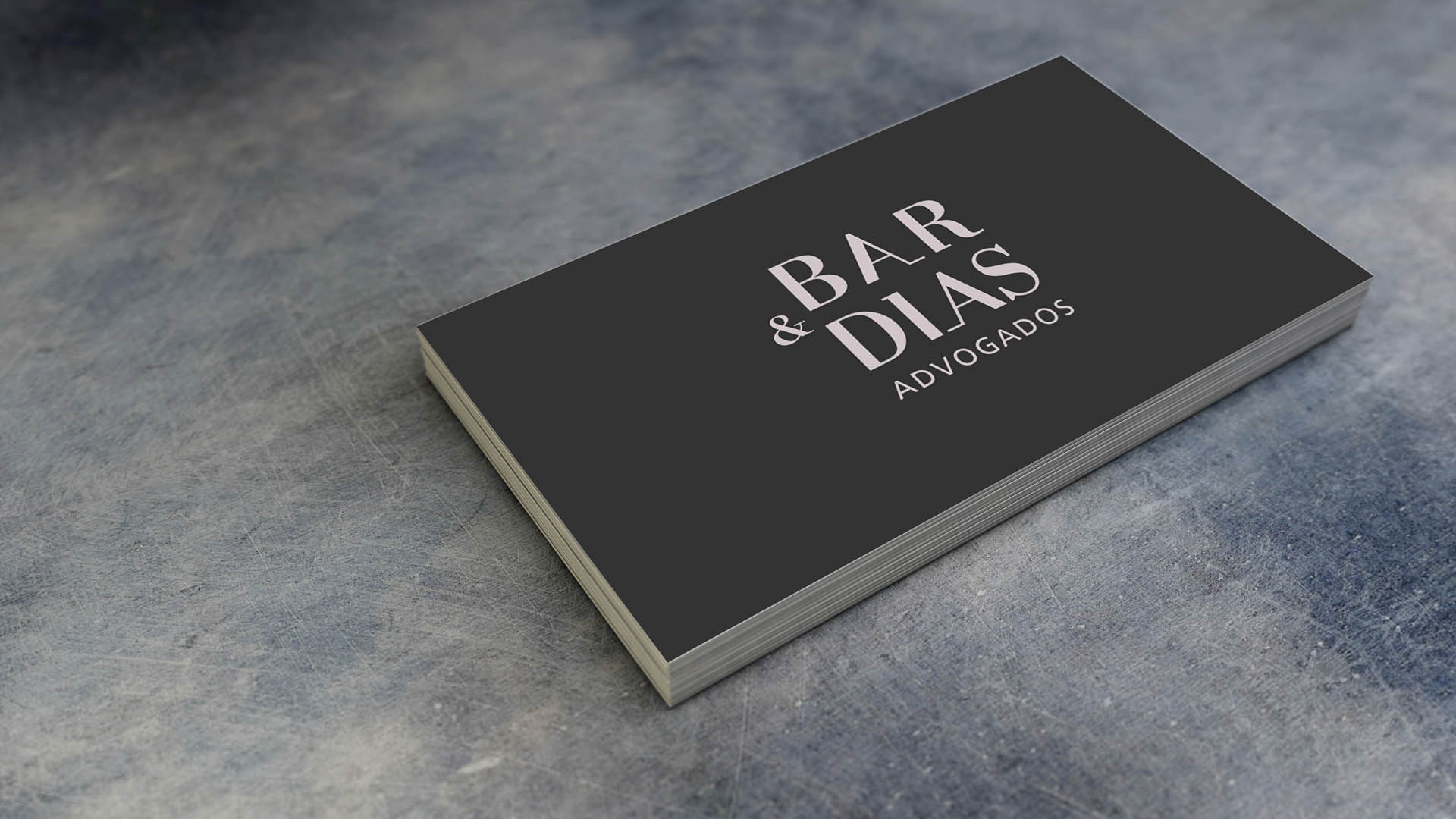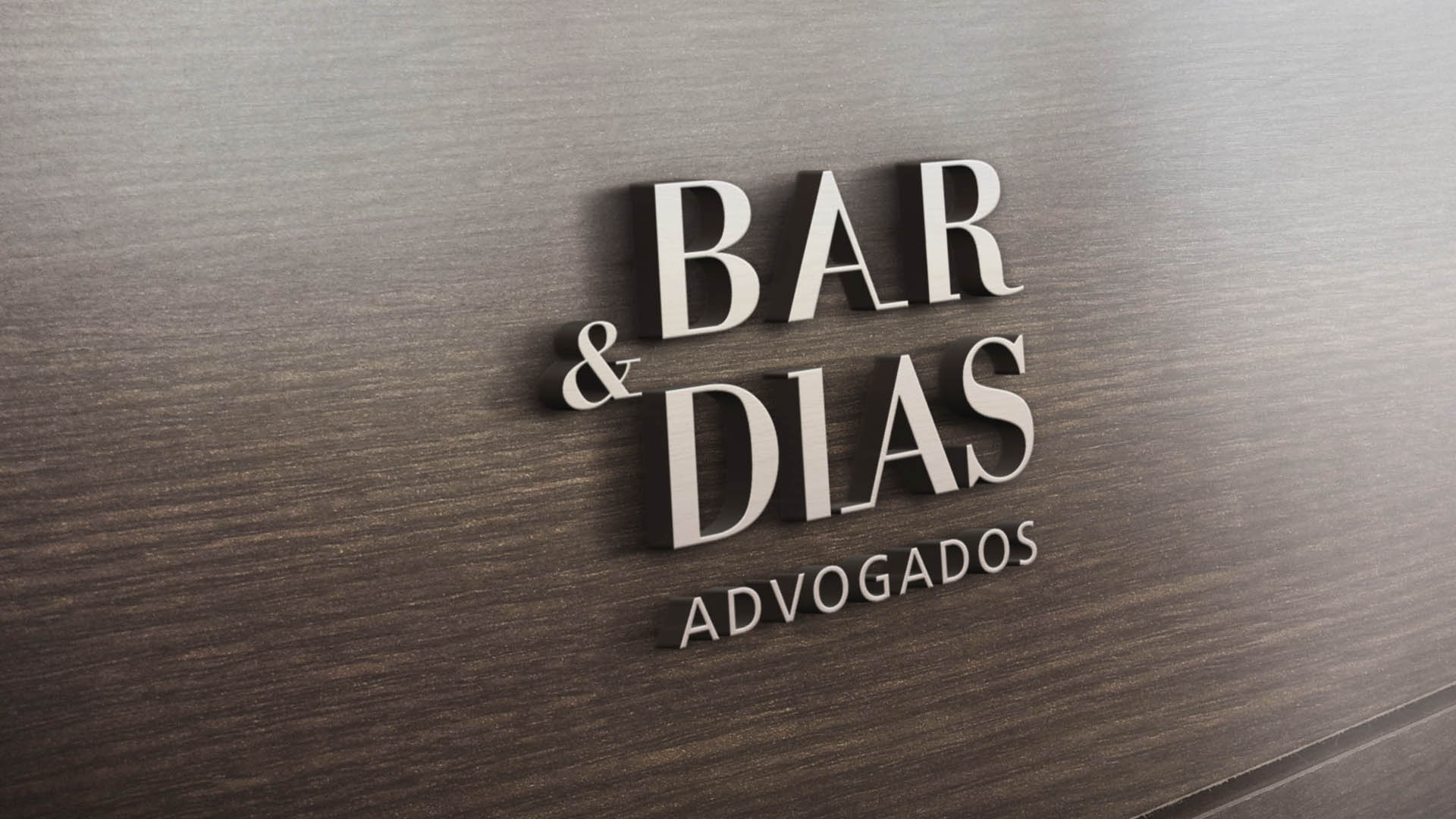


Julia Dias joined Daniel Bar for an old but, at same time, a new office. The same seriousness as before, but now with a woman running it. The challenge of uniting Bar e Dias in a unique identity, creating a brand for law firm.
Redesigning the brand Bar e Dias (which had previously been created in a rush to identify the new partner in the office) bringing all the values of the pair and the female and male sides of the office, and positioning the new company, while emphasizing all its solid journey up to then.
Trust and balance.
The solution for the office brand needed to bring the sobriety and balance of a law firm. Value the knowledge and experience of the members not only through their reputable surnames, but also through a typography that evidenced all these values.
Sobriety and responsibility.
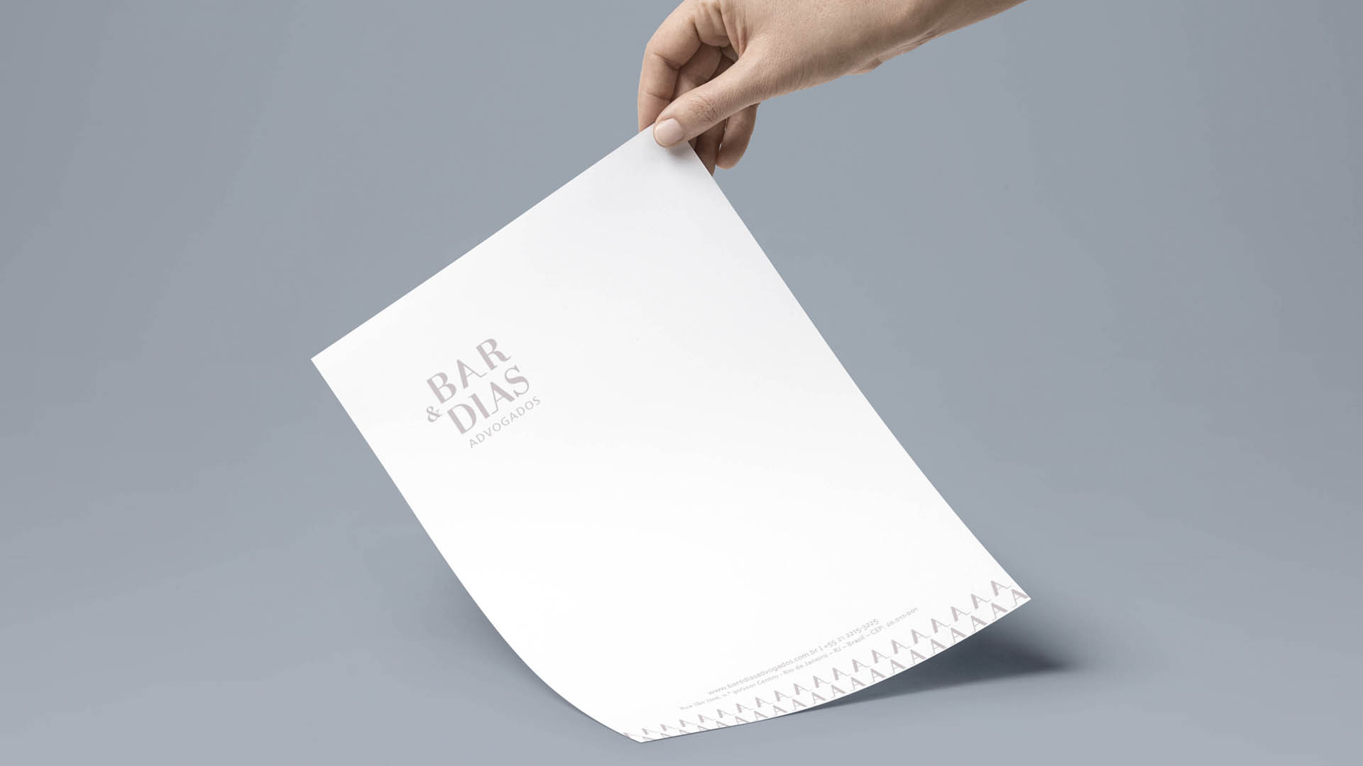
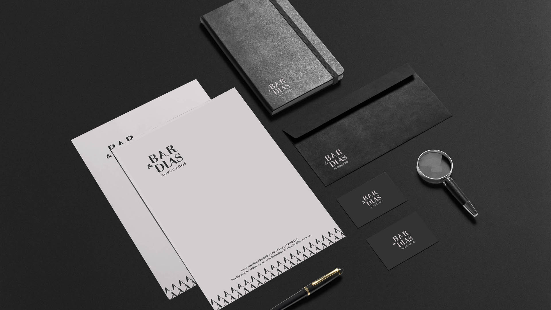
A typographical and objective mark. The serif font creates continuity between names. The A’s, of bAr and diAs, reveal balance and trust among partners and clients. A’s show the two sides that are always present in any case accompanied by the office and also the partners’ attentive care, in order to jointly cherish the best for each of their clients.
A square box, a solid format.
The colors bring simplicity and sophistication: an accessible office, which dialogues with the client’s own language. From the nude tone of the brand, making reference to the human side, to the gray tone, representing the troubled difficulties faced by every proceeding. A balance that is consolidated by the trust represented by the Bar e Dias law firm.
Finally, a print with the AA’s bringing the representation of the continuity of the law service. Bar e Dias represents the prevention of stress, saving time and money when one hires the office to avoid problems and not only to solve them.
Let us introduce it to you: Bar e Dias, from gray to nude – a law firm brand.
