

California Náutica was built with the desire to offer a marina experience beyond the conventional. Its goal is to attract boat owners who aspire to explore and experience the lush nature of Capitólio, but need a personalized marina service capable of meeting all their needs.
January 2022 marked the history of Capitólio with a tragedy that claimed the lives of 10 people and drastically affected tourism in the region. Our biggest challenge became creating a brand that could inspire a sense of security and assist in the resurgence of tourism activities in Capitólio. With California Náutica present in the region, sailors already know which path to take. In addition to a complete and personalized service, its visual identity needed to express its enthusiasm, beauty, and confidence in the brand.
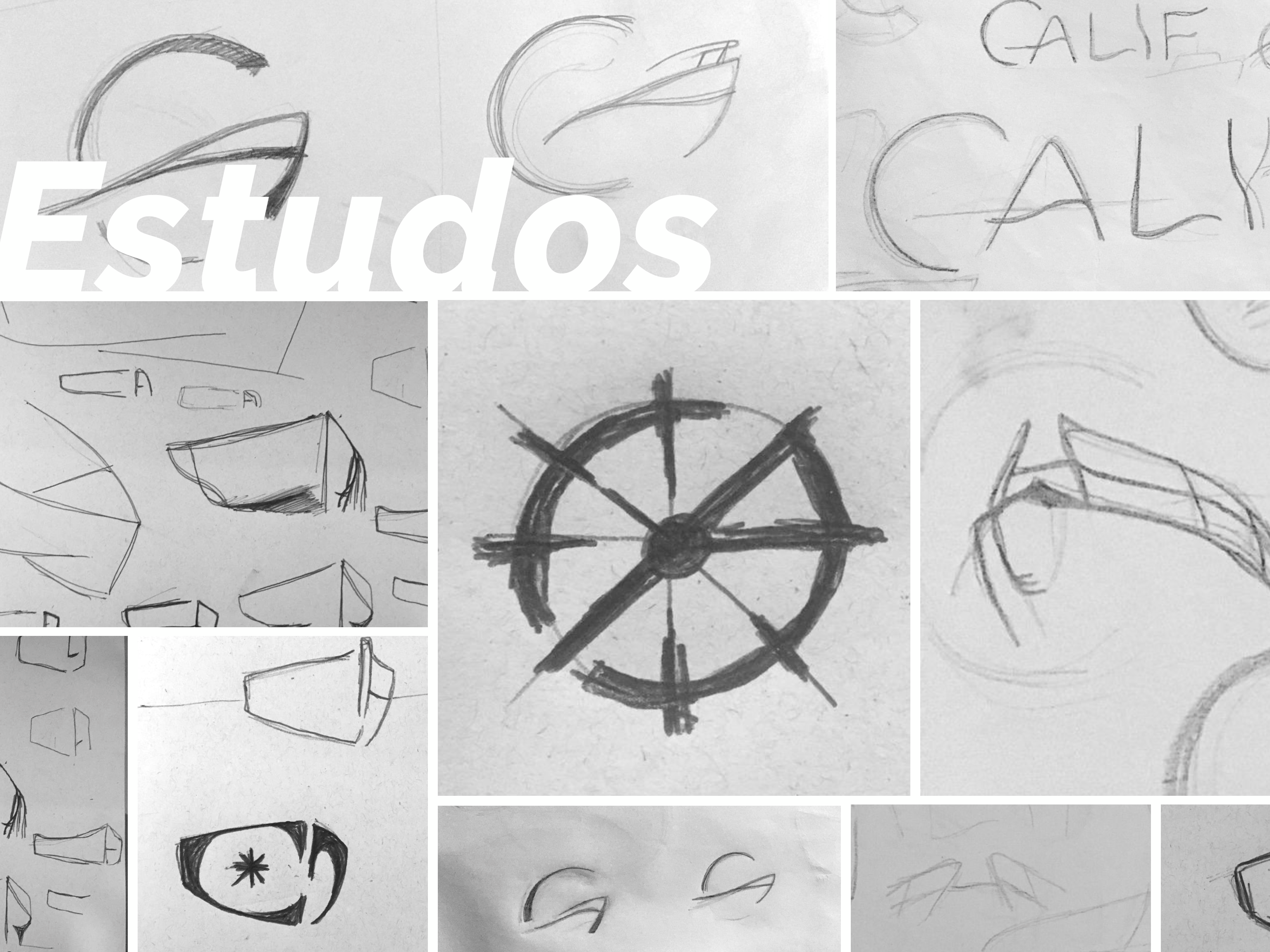
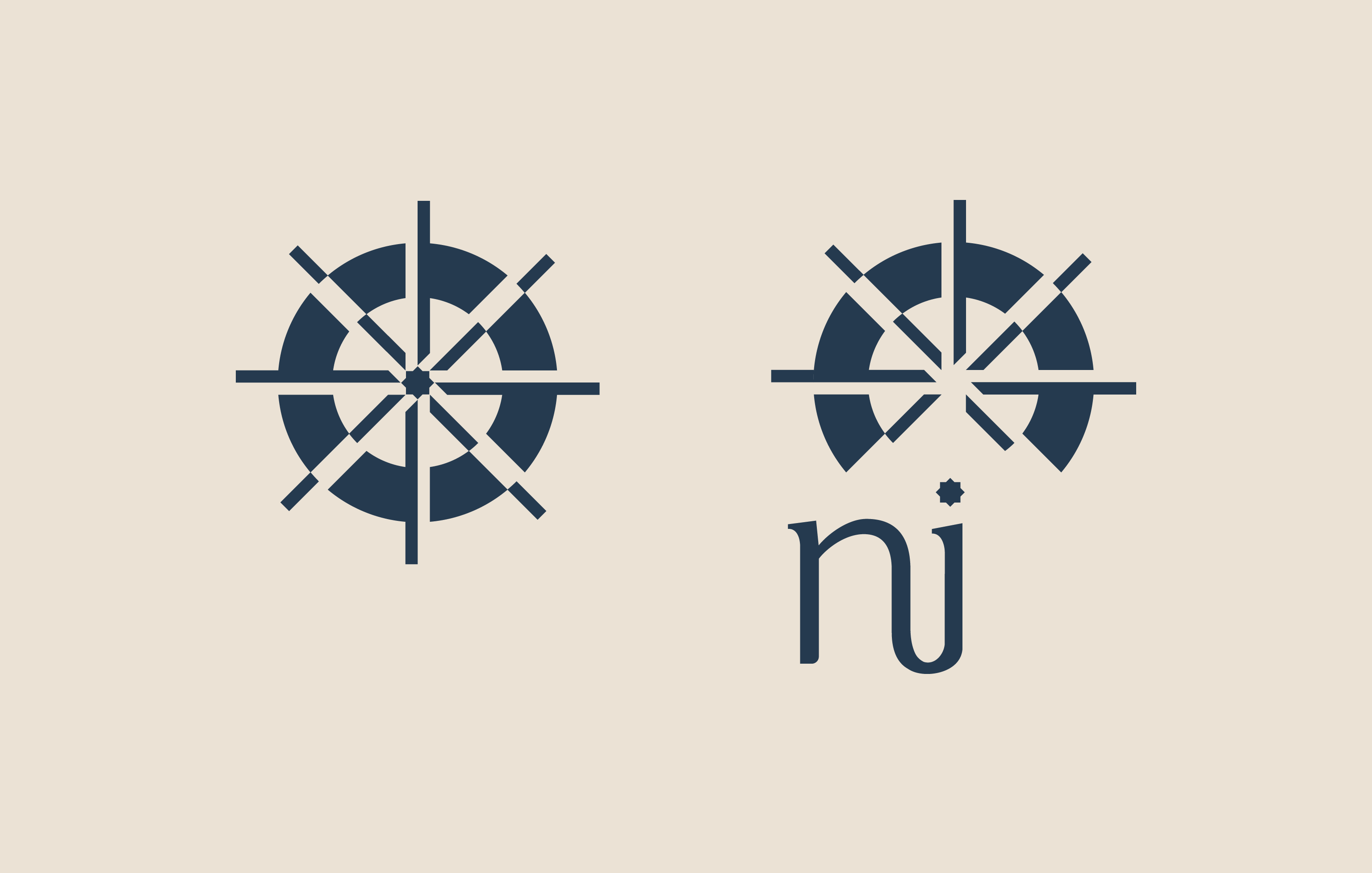
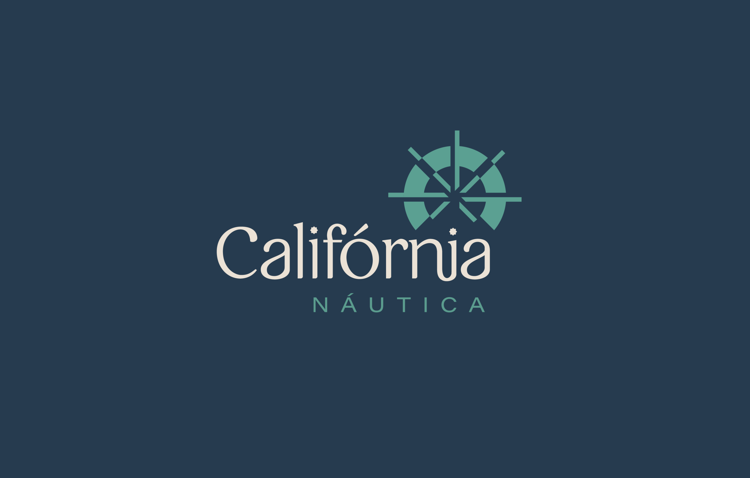
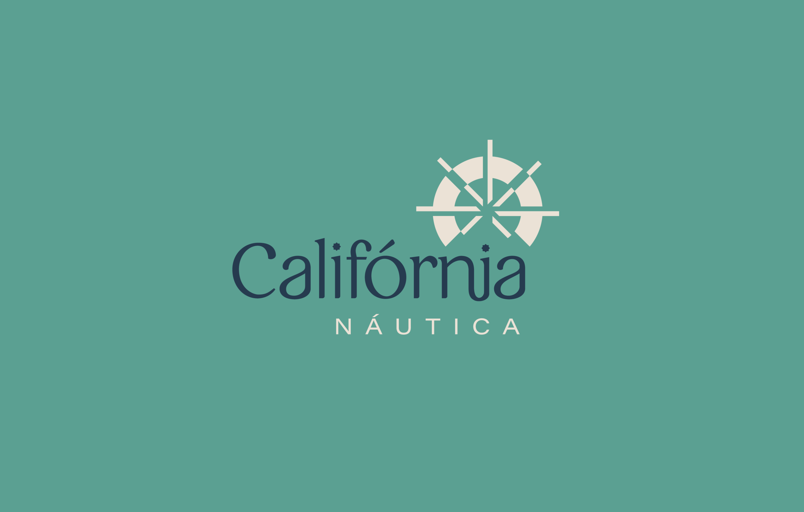
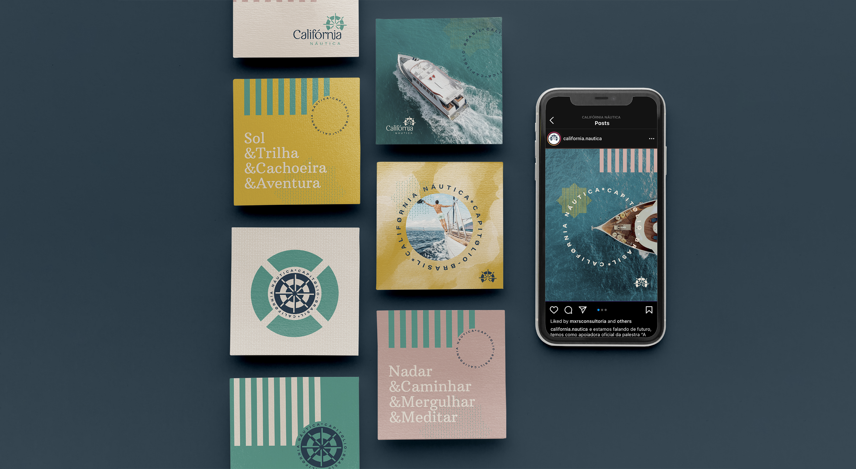
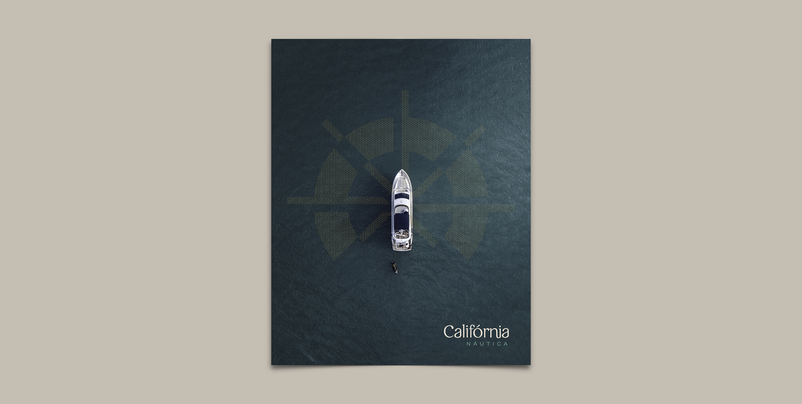
In addition to a personalized marina experience, California Náutica also offers comprehensive support for boats, creating a relationship of trust with its customers. The California Náutica concept takes us into the world of boats, in a vibrant and contemporary approach, where the central point of the brand is in the representation of the helm, essential for controlling the direction in navigation. The helm represents the safety the brand offers its customers. The visual identity was designed to create connection and engage its audience, using a variety of visual elements that interact harmoniously, conveying joy and organization. The lettering of the word “California” features semi-serifed typography strokes that bring modernity without renouncing a humanistic language.
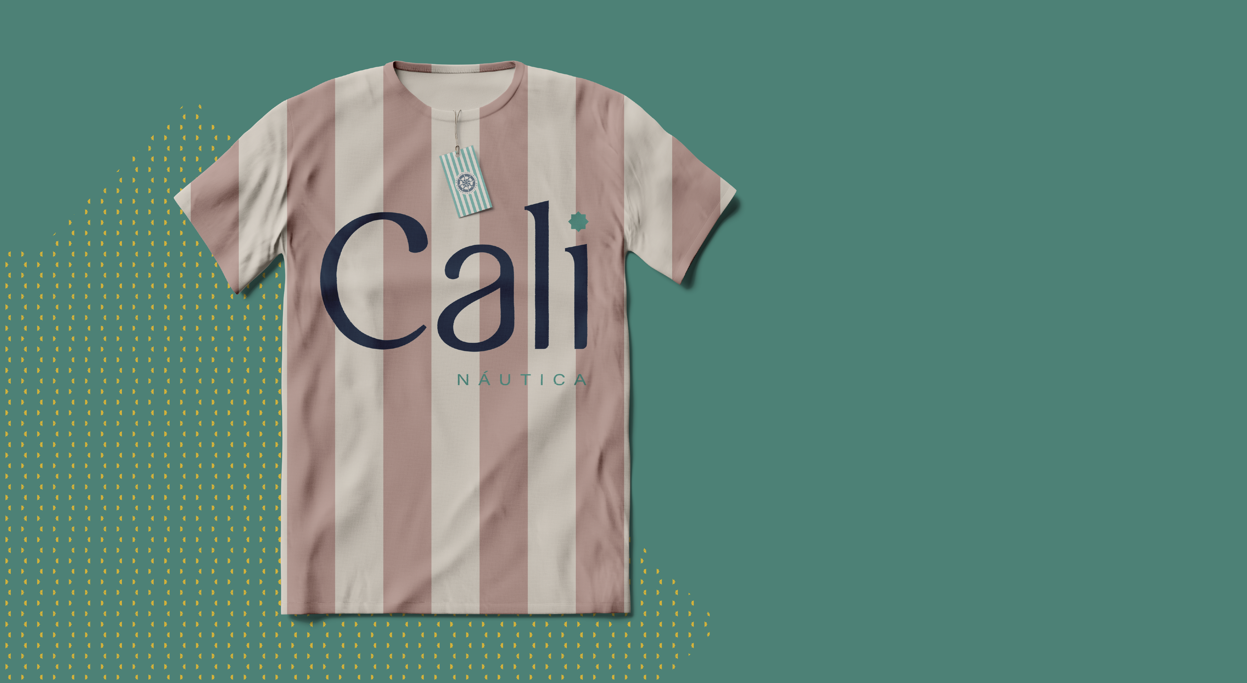
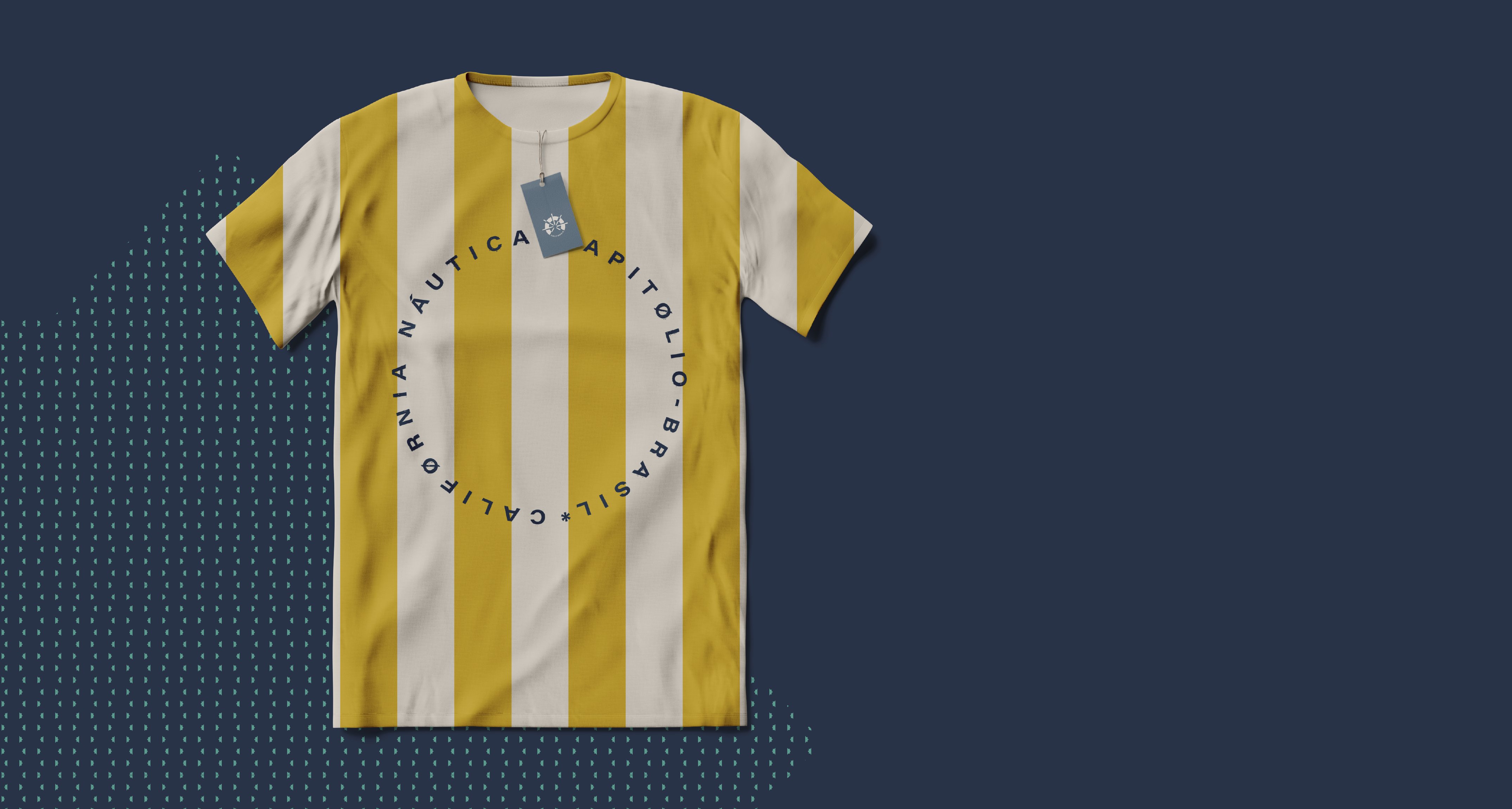
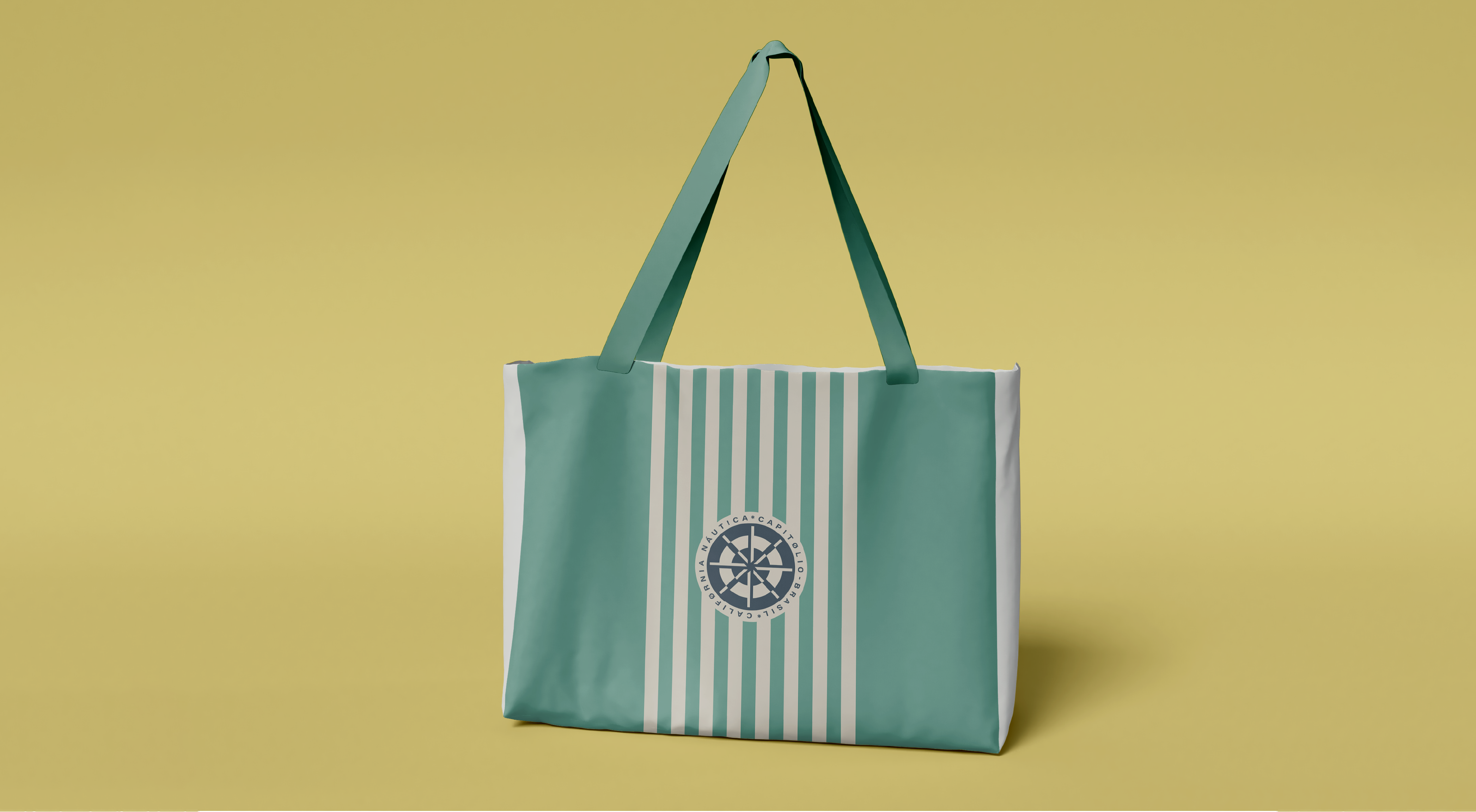
California Náutica, as a brand aimed at promoting tourism in the Capitólio region, needed a diverse palette to convey its personality. We selected colors that translate the landscape of Capitólio, with shades of aqua green and golden yellow, harmonized with colors that communicate sophistication, closeness, and security for the brand’s identity.
The chosen shades for the California Náutica brand brought dynamism to communication pieces, revealing a sense of joy without sacrificing sobriety. The icon was designed as a dynamic and adaptable form for different contexts, providing versatility and practicality to the brand. It has a symbolic character, represented by a hybrid shape that refers to the helm of boats, maritime buoy, and the sun. The different versions can be combined harmoniously with the visual elements of the identity, creating a strong and consistent language that remains cohesive even without the presence of its main symbol. Its characteristic and impactful format contributes to greater differentiation and brand recognition.
Need help implementing or developing your Visual Identity project? Contact Criamia here.
