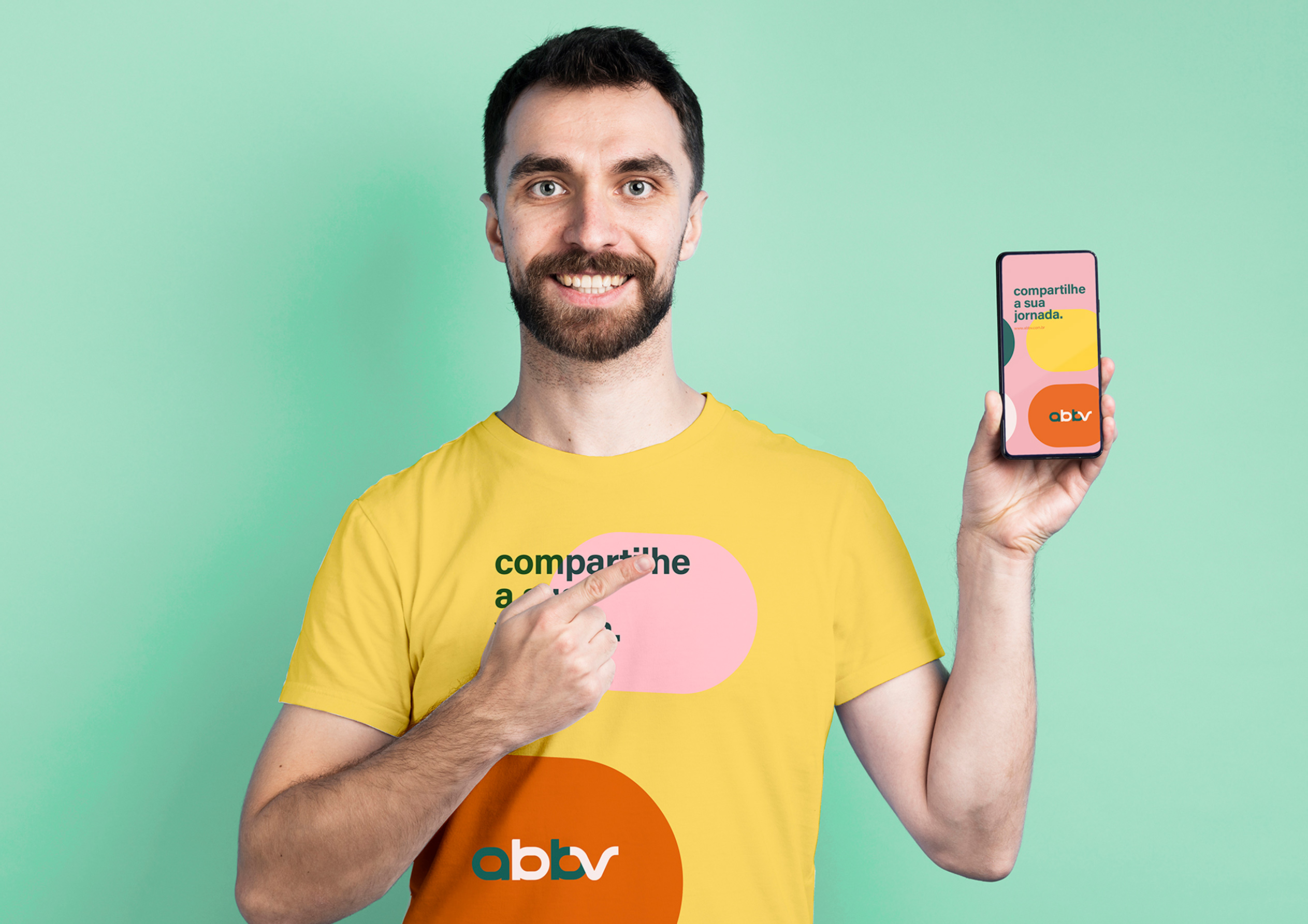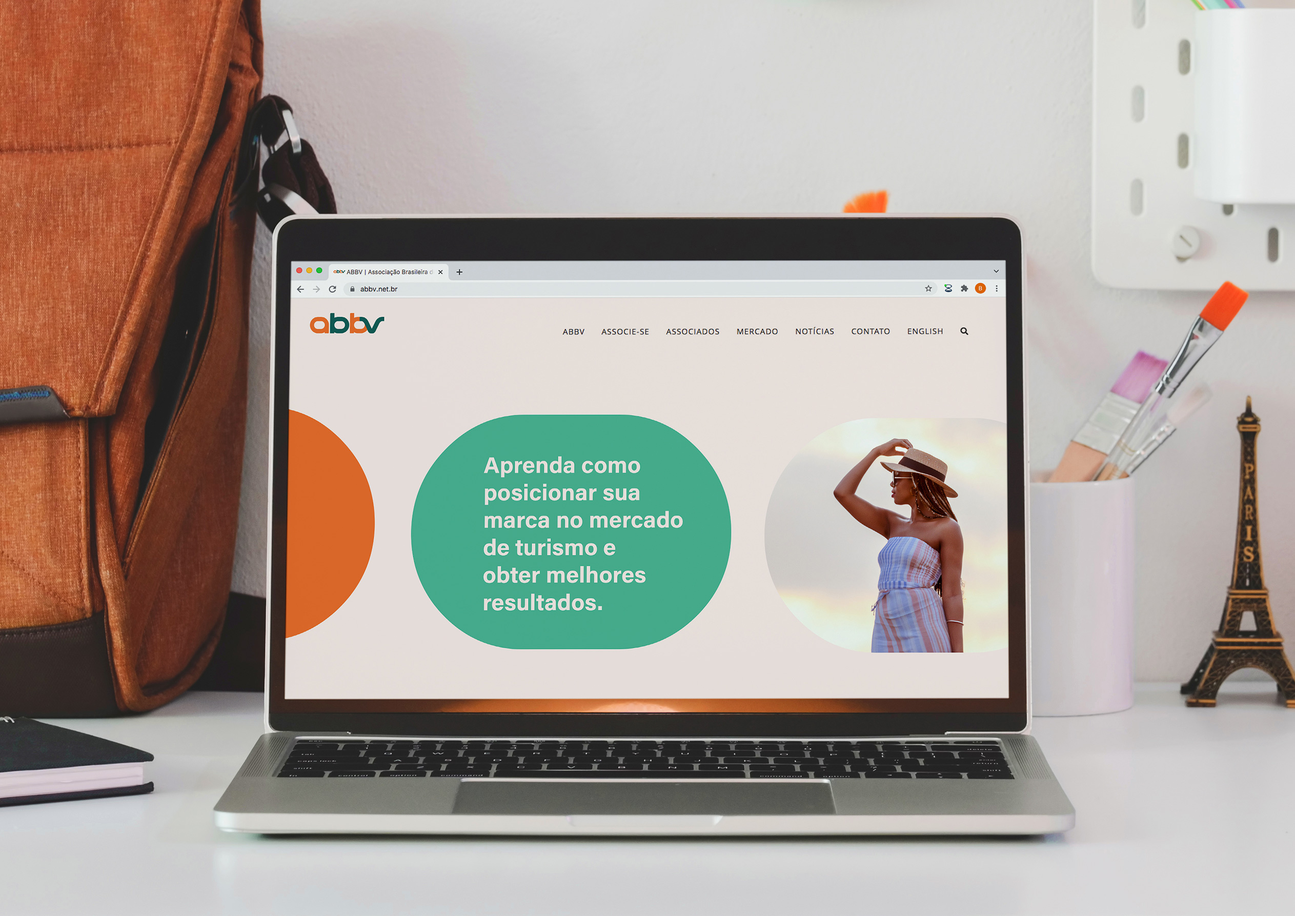


ABBV completes 10 years, believing even more in the potential of its associates to leverage the tourism economy in Brazil and make each of these entrepreneurial journeys a dream come true. In its tenth year of history, there was a need to communicate to the market a new moment of maturation and growth of the association through a Brand Rebranding.
ABBV stands out in the digital content market, focusing on the tourism segment, due to its high collaborative performance and its credibility with companies from different segments. It was Criamia’s mission to design a brand strategy capable of connecting entrepreneurs passionate about travel and large companies, in order to exchange inspiring experiences and enhance business relationships.
We see a future where content creators live exclusively from what they love to do most: turning a simple trip into an inspiring, shareable and profitable experience. Criamia has developed strategic tools such as Archetypal Image, Brand Persona, Speech and Tone of Voice, in order to position the ABBV brand at a level of attraction, inspiration and market potential. ABBV, as the brand that highlights the power of sharing travel experiences, needs a color palette that expresses its commitment to diversity and its strength in the collective. At the same time, it must convey the feeling of freedom and fullness that only a travel experience can provide. The concept of ABBV’s Visual Identity reminds us of unity and diversity. The typographic composition is robust and minimalist, conveying a sense of balance, simplicity and wisdom. Its horizontal aesthetic communicates the new moment of expansion of the association and its repositioning in the tourism market.
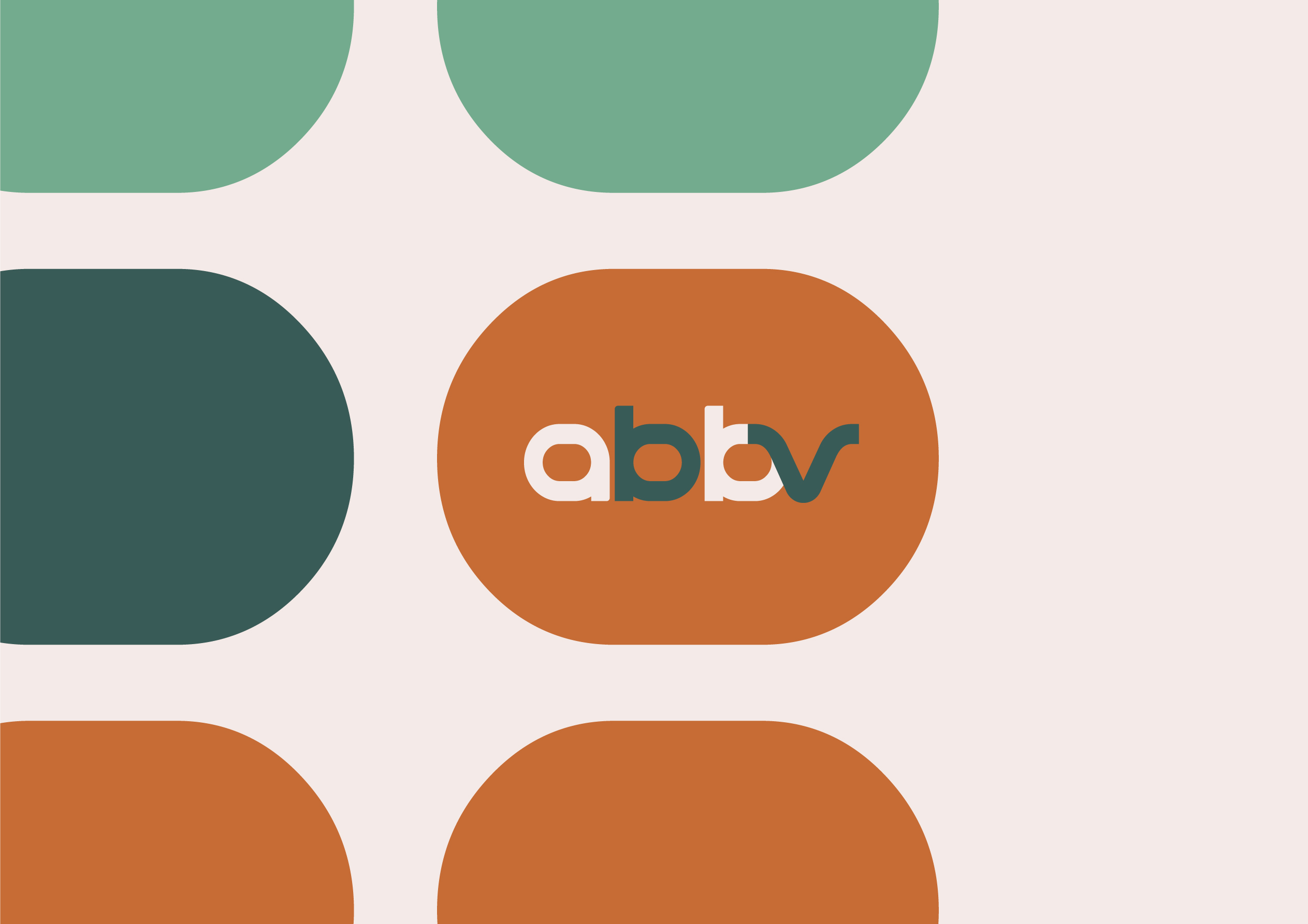
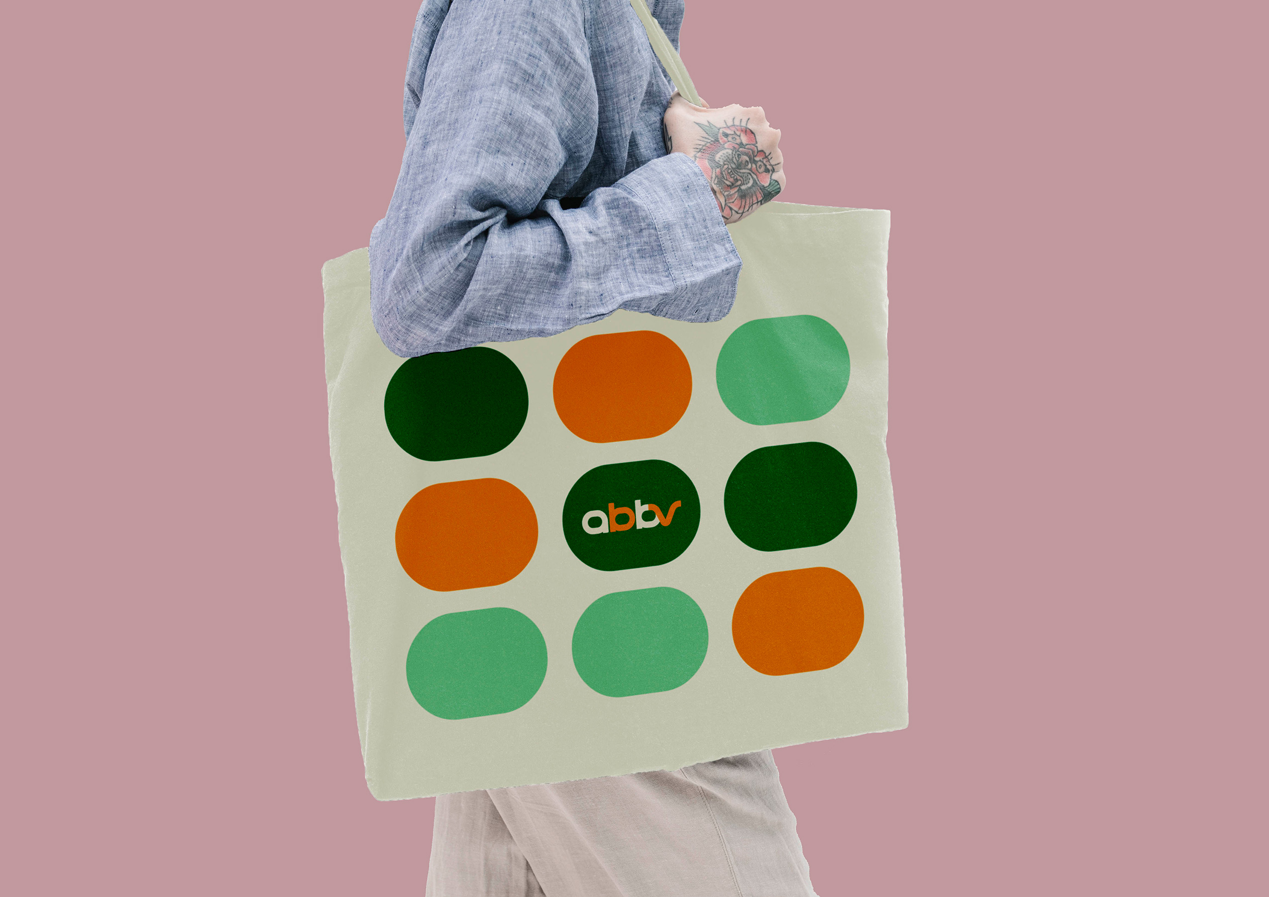
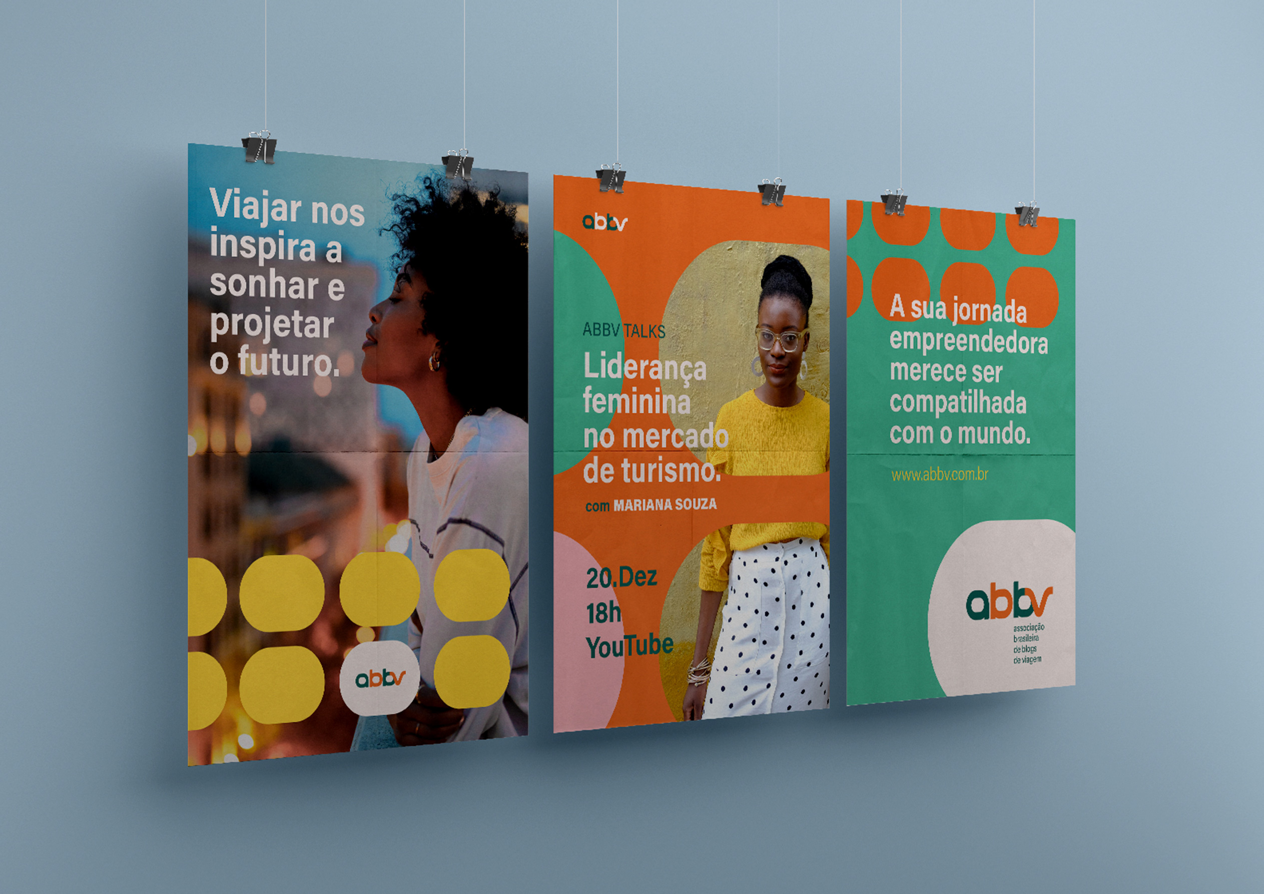
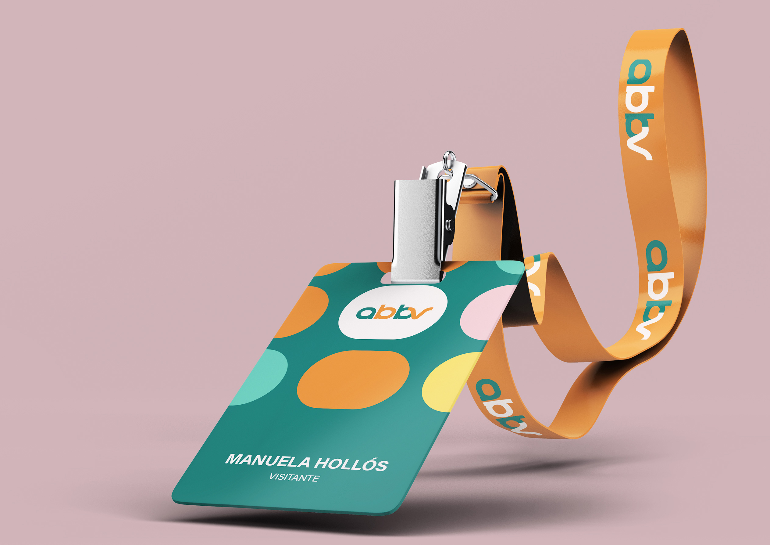
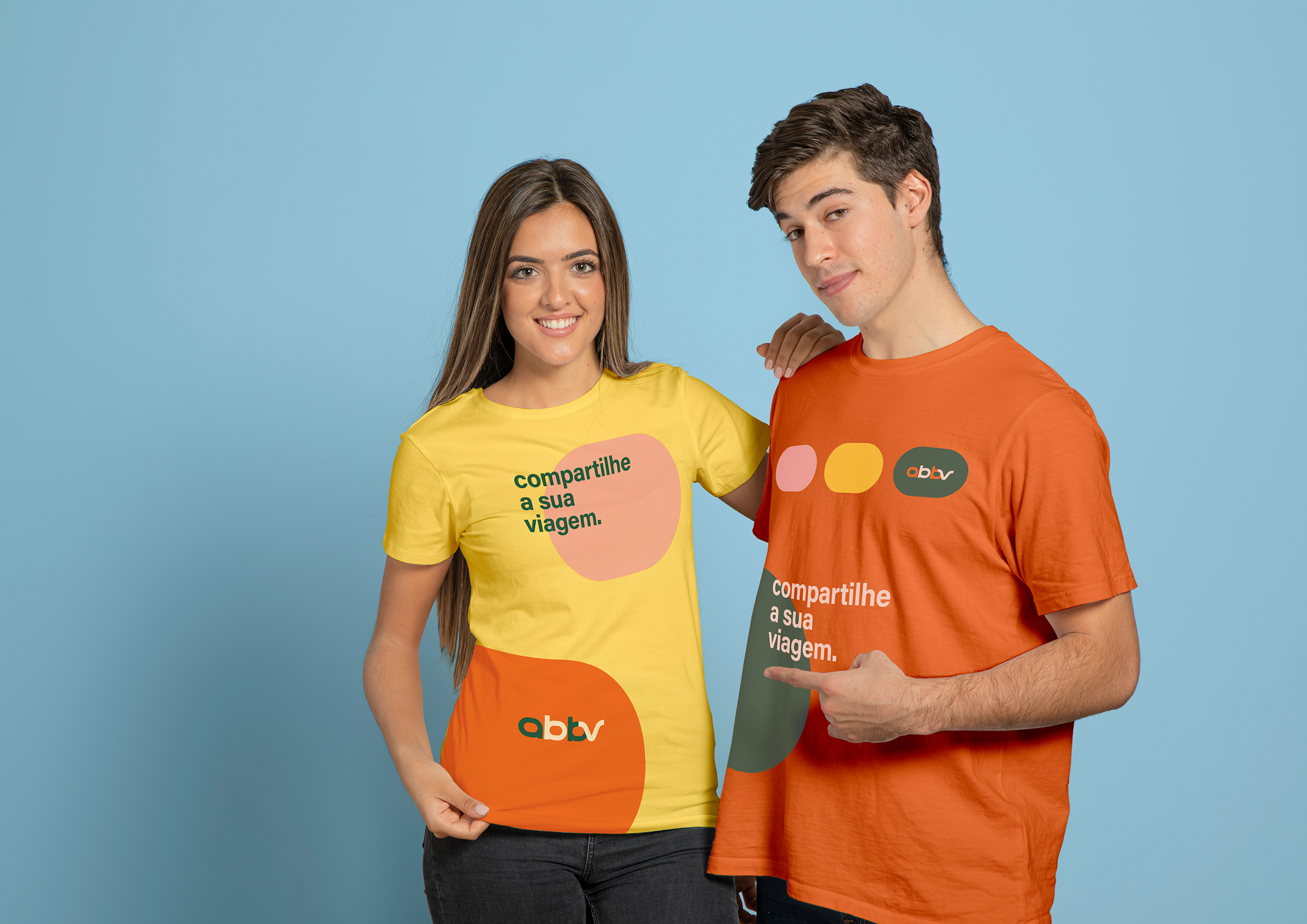
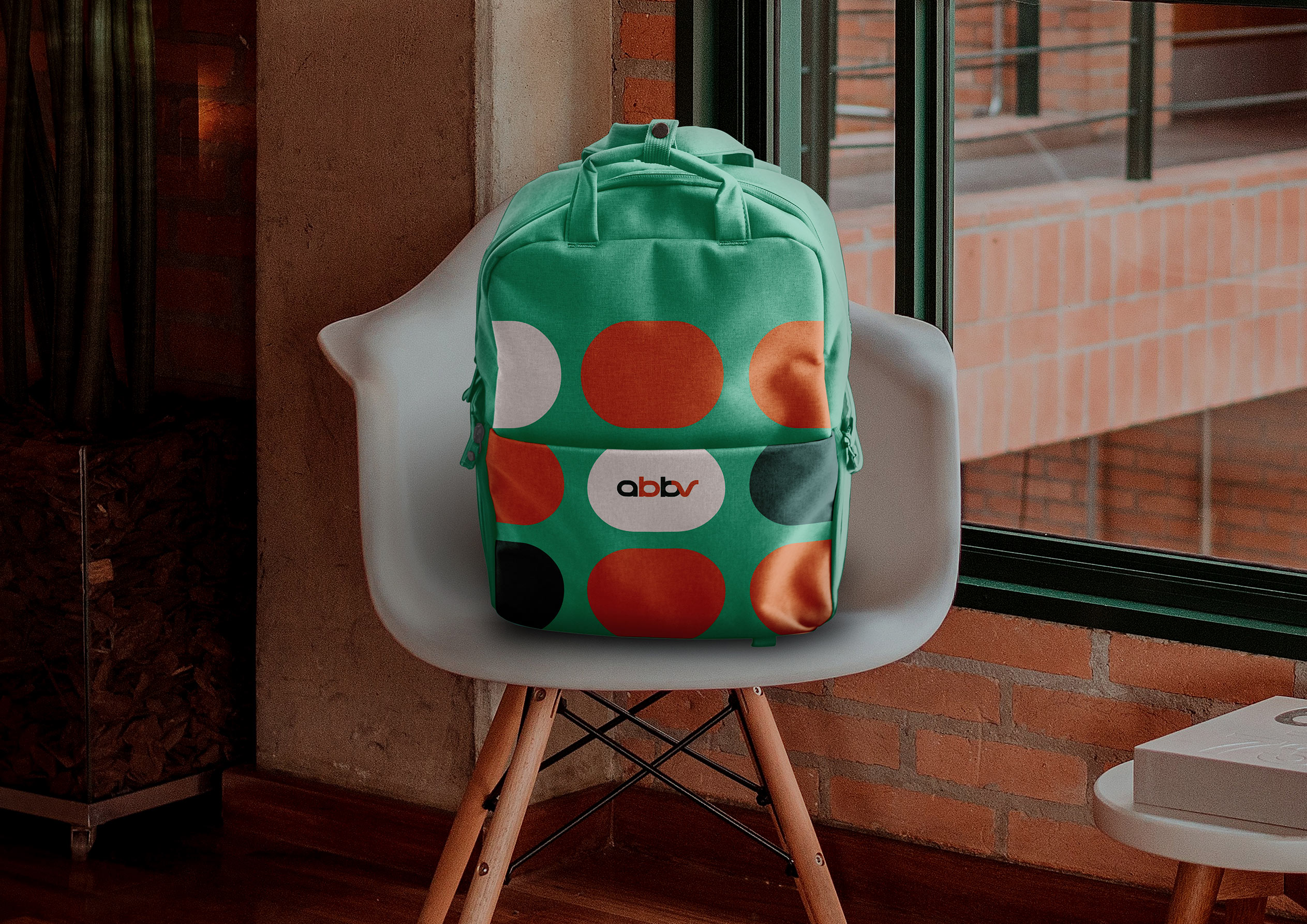
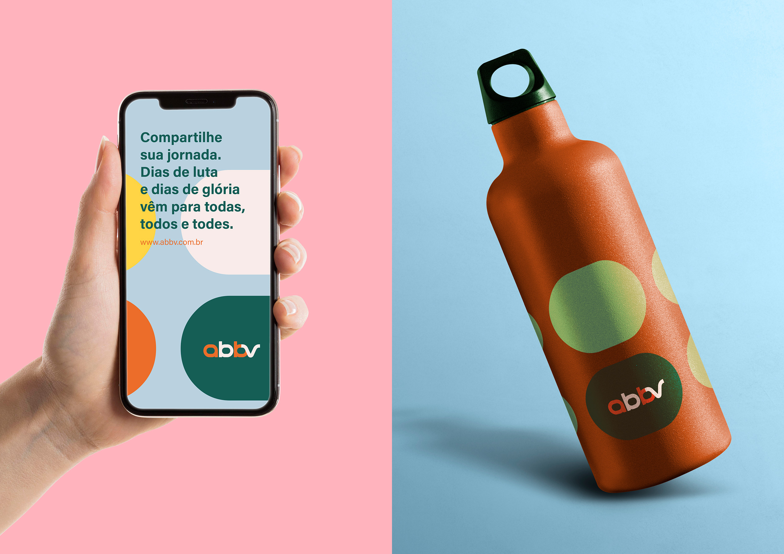
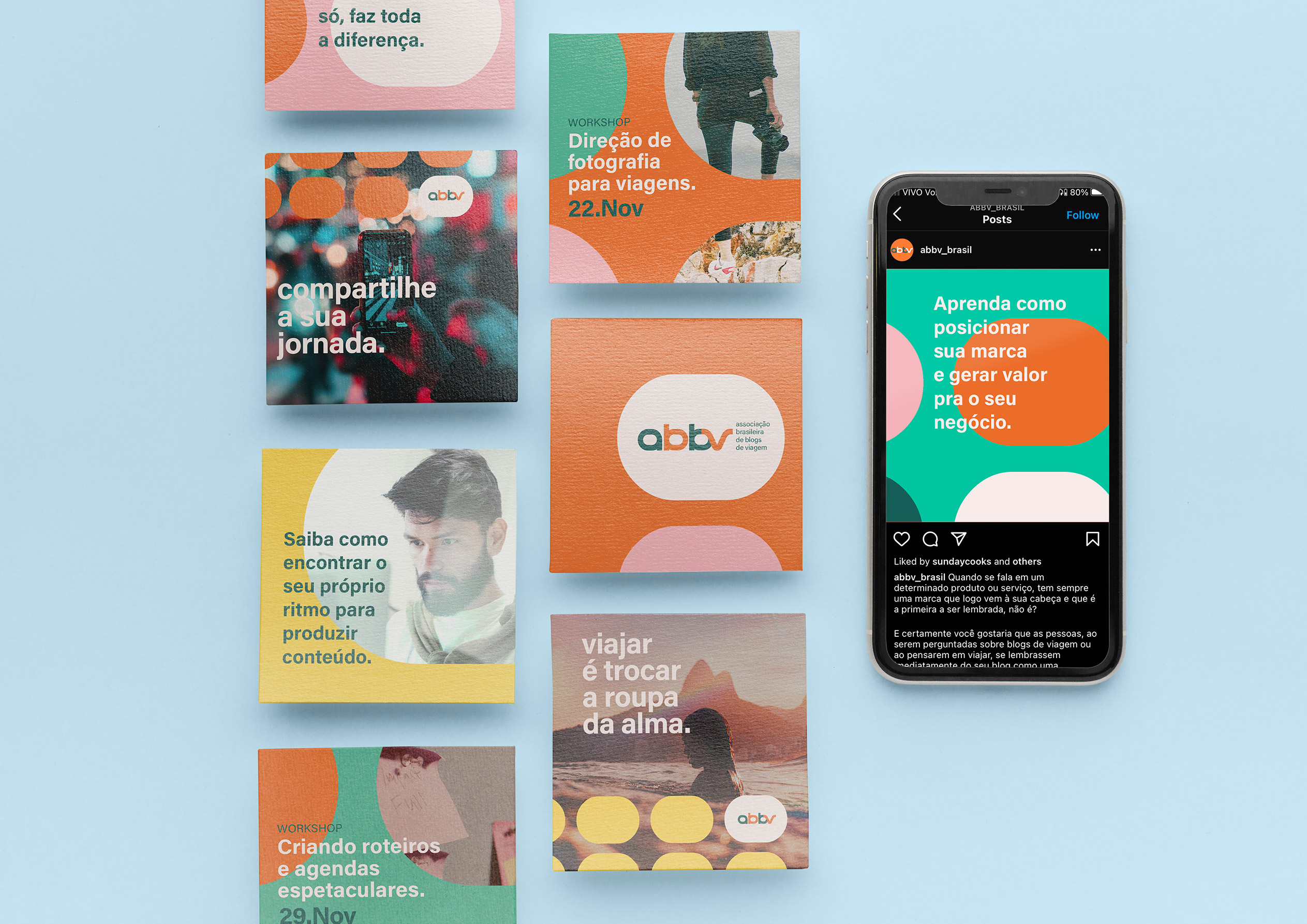
The ABBV brand promises to inform, encourage, connect and differentiate content creators in the tourism market. The visual appeal of the new logo suggests symbols associated with movement and freedom, such as a locomotive that forms at the junction of the letters “abb” and the silhouette of a bird present in the letter “v”. We strategically thought of a minimalist and dynamic branding system that allows applications in different categories of media and materials. The graphic elements, extracted from the counter-form of the letters “a” and “b”, assume different symbols linked to the tourism universe, such as balloons, clouds, airplane windows and train cars. Through their colors and their modular fit, they represent the multiplicity of journeys, the union and constant collective movement of the association.
